For the final project in the course, I had a number of ambitions:
- to continue to look at the subject of iron smelting and casting
- to use my own created chine colle papers
- to combine monoprinting with carborundum printing, inspired by Barbara Rae
- to explore the subject of Barbara Hepworth’s sculpture and garden and St Ives which I had recently visited
- to move towards abstraction
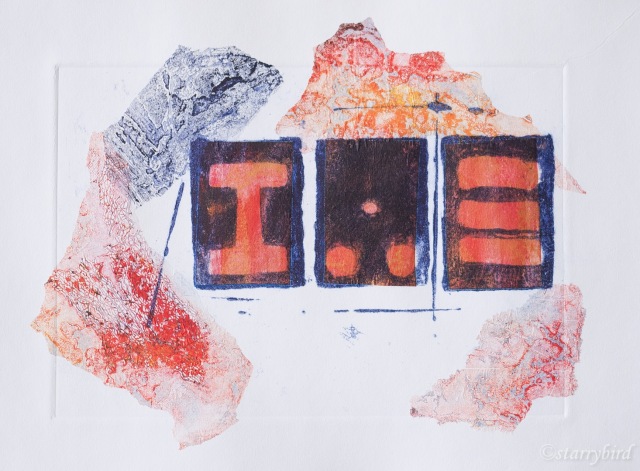
Print 1 – Cast Iron
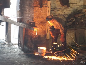
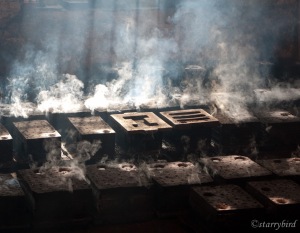
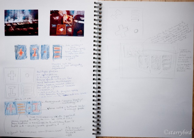
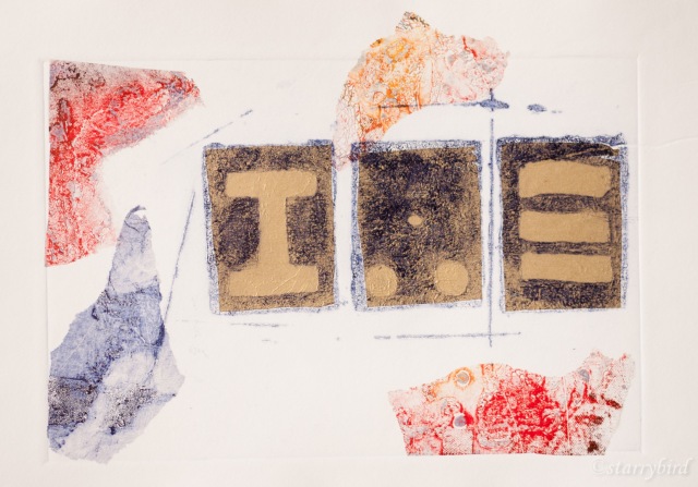
I wanted to continue exploring the process of casting iron and trying to represent it in a abstract form. In my sketchbook, I had looked a various shapes involved in the processes, the steam hammer, the crucible etc and fixed on the shapes of the molds for this print.
I considered using a digital image, either of the metal being poured into the molds, or of the smoke rising from the hot molds, combined with carborundum shapes representing the various molds. Playing about with cut outs and small photos, I couldn’t arrive at an arrangement which satisfied me. However, when printing my previous ‘Alchemist’ plate, I had run the plate through the press with tissue paper to clean it between prints, and this had created some interesting tissue which I could use for chine colle.
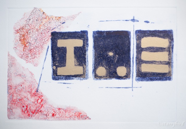
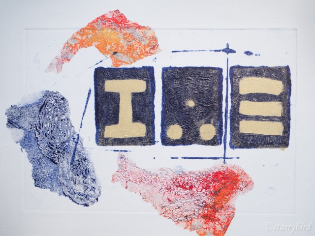
To create my plate, I covered a board with sticky back plastic, for wipability. My basic shapes where cut from card, painted with micaceous oxide acrylic paint (like carborundum) and stamped on the plastic. This created shapes with some texture but also not too exact. I also painted some card edge and sticks and created some linear shapes which echo the shapes of the bars which lift the crucible and which I hoped would help link the elements of the print.
I tore my printed tissue into rough shapes to evoke oxidised bloom, a waste product of iron working. Gold tissue was also used to provide the molten metal in the molds. This was cut sufficiently generously to give a shimmer to the whole of each mold shape.
In my initial prints, I was too sparing of the printed tissue. I also didn’t like the relationship between the plate edge and the tissue edge.
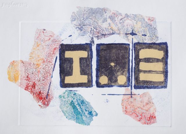
I reprinted with more pieces of tissue, placed to overlap the plate edge.
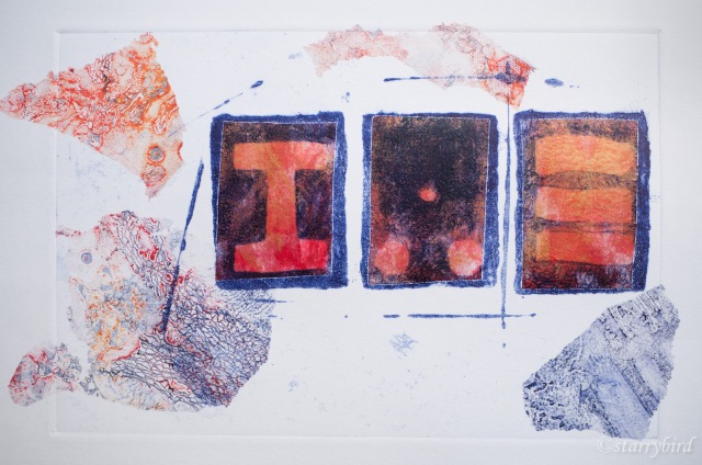
I felt the gold was a little too cool, so created a tissue paper in reds and gold by monoprinting onto tissue using a gelliplate and acrylic paint.
The monoprinted tissue showed a slight, white halo in the molds, so I have softened this with a tiny amount of watercolour.
Critique
Throughout the project looking at iron founding and casting, I have strived for increasingly abstract representations, and am pleased to have finally ended with a print which is almost completely abstract. The strong, simple shapes of the molds are offset by the linear elements and the irregular, textured chine colle shapes.
I could have filled the plate with chine colle and created a solid background, but I think the irregular shapes are more interesting and leaving areas of white support provides quiet areas for the eye to rest.
The lines help lead the eye around the shapes and add interest to the negative areas. Overlapping the chine colle with each other and the main shapes also helps unify the print. Extending the tissue outside the plate edge breaks up that hard edge and avoids the usual rectangular print format. I hope the viewer will find their eye going to each of the shapes and finding interesting, contrasting areas of colour and texture.
Making my own papers means that the constituents are all archival. I think the three monoprinted rectangles are an improvement over the gold tissue, but left a slight white halo and I am disappointed with having to fudge these edges with watercolour. Hand colouring can often look contrived but hopefully it is in-obvious here. The tissue was positioned a little too far to the left on two of the shapes, leaving some white inside the molds. This is just part of the character of this print; I wouldn’t wish to use watercolour to disguise this. Positioning the glued papers on the plate with precision is really difficult. My support has creased slightly at one edge going through the press, due, possibly to uneven dampness or uneven pressure across my reclaimed mangle rollers. If I were starting again, I would use Somerset paper rather than Snowdon.
I have really enjoyed exploring this theme in different ways by creating a linked series of prints.
Print 2 – Homage to Hepworth
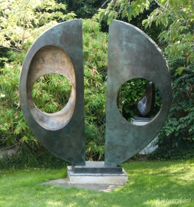
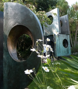
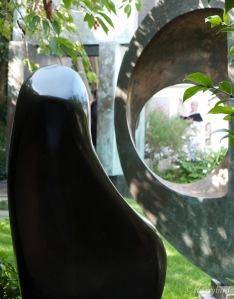
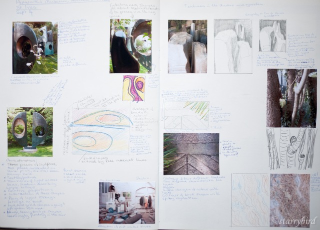
I recently visited St Ives, the highlight of which for me was Barbara Hepworth’s house and in particular the sculptures in the context of her garden. The garden and studio had lots of shapes and textures which inspired me and I took lots of reference photos with the specific idea of developing a series of prints. This was extended to other textures around St Ives especially in the sea walls.
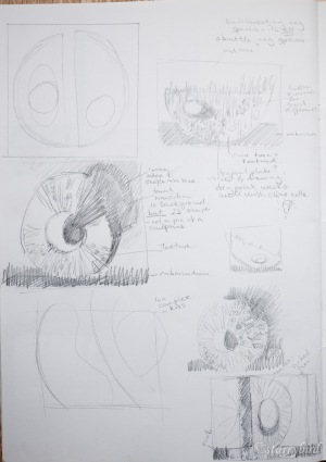
My first response to the reference material was to look at the shapes of the sculptures in the garden.
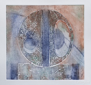
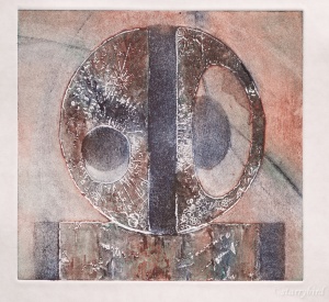
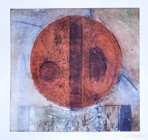
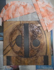
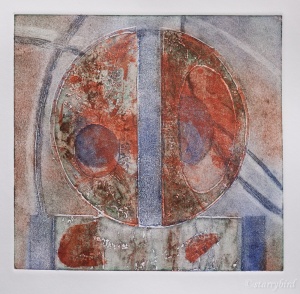
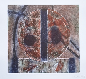
I tried all sorts of ways of cropping the shapes, extrapolating the curves, focusing on the negative space, but in the end I chose a simple representation in homage of one bronze. I created a collagraph plate using carborundum and tile cement. The original sculpture is smooth but I have created texture inspired by the moon, suggested by the circles and ellipses. This would allow me to ink and wipe at different levels, increasing my colour range. I also hoped to include some bronze coloured chine colle and the texture should provide areas where it would show through as a patina. Drypoint lines and swipes of varnish were added to vary tone in the background.
The print was initially printed without chine colle to explore inking techniques.
A circle of tissue painted in copper acrylic was then applied.
The ink didn’t take very well over the tissue, leaving the copper too dominant. This photo flatters the print. I decided that the copper needed to be more subtle and less uniform, so I monoprinted some tissue with very thin layers of copper paint. I also thought two pieces of tissue would be an improvement and I reinforced the areas of carborundum which were wearing.
The inking here is too weak, leaving the copper still too dominant.
This has given a better tonal balance but the effect is rather crude and heavy handed. I am not convinced that the chine colle adds anything. On reflection, I think the initial prints employing colour rubs, in the manner of Brenda Hartill, are the most effective and subtle.
Critique
This print was inspired by sculpture by Barbara Hepworth in her garden in St Ives. A collagraph plate was chosen as the technique because of the sculptural quality of tile cement used for the main shapes. Areas of tonal contrast were created with carborundum and locally applied swipes of varnish, which also created linear shapes in the background along with drypoint lines.
The main shapes were textured, inspired by the lunar landscape suggested by the circular and elliptic forms. A textured approach was chosen to allow inking at different levels and the use of coloured rubs, in the manner of Brenda Hartill. The curved lines in the background also relate to lunar orbits, adding interest to the design, but I would have liked them to print just a little darker. I find the inspiration of astronomy creeping into my work almost unconsciously.
The raised edges of the tile cement were sanded to try and reduce any white halo around these shapes, and whilst this did work to some extent, the slight white halos are a positive addition to the print, adding tonal variation and a three dimensional effect.
The colours were chosen based on the patina of bronze and I had hoped to include bronze chine colle, but, in the final analysis, the more subtle effect of colour rubs produced the more interesting print.
Whilst the design has drawn very heavily on the sculpture of Barbara Hepworth, which I would always wish to acknowledge, I think the print stands on its own as an abstract design and the viewer does not need to be aware of the inspiration or the subject. I hope they are drawn into the calm relationship between the simple shapes and lines and the subtle texture and colour.
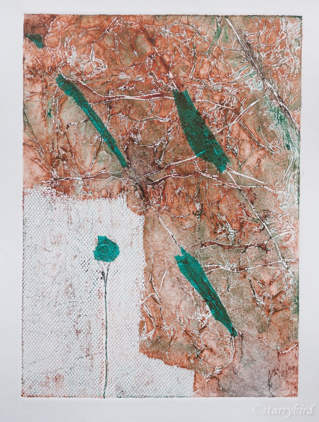
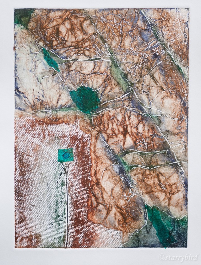
Print 3 – St Ives Cliff
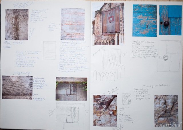
In the Hepworth garden and around St Ives, inspired by sculpture, I collected images of textures and shapes and experimented with these in my sketchbook.
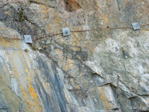
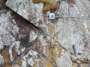
I could have created a whole series of prints out of this source material alone, and may yet do so. I chose a detail of the sea cliff to work from because of the mixture of man made and natural materials, the diagonal structures and the way the colours echoed the Hepworth bronzes.
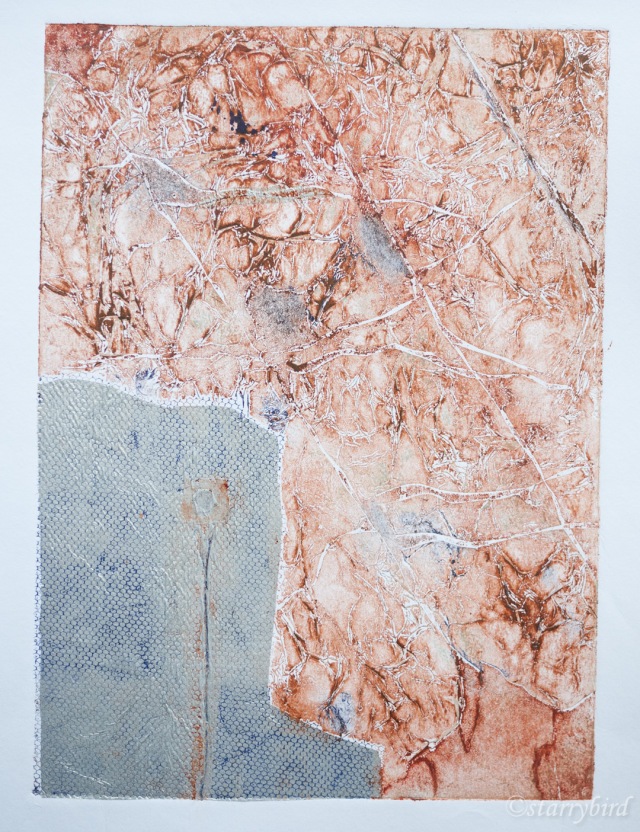
I did not want to create an exact image of the cliff, but to pick up on the essence of the cracks, colours, the metal nut and mesh against the natural texture. I created a plate by cutting diagonal ‘cracks’ into card and then pealing back layers and overlaying glue and tissue paper. I then added mesh and string for the metal mesh and cable and cut out a shape for the nut. The whole plate was varnished to seal it.
In my initial print, the contrast of material was emphasisied by the addition of silver tissue over the mesh. Small areas of silver tissue were applied in other areas to create a rhythm. Unfortunately the mesh didn’t really print over the silver, but it got completely lost in the texture of the rock, so I abandoned that idea.
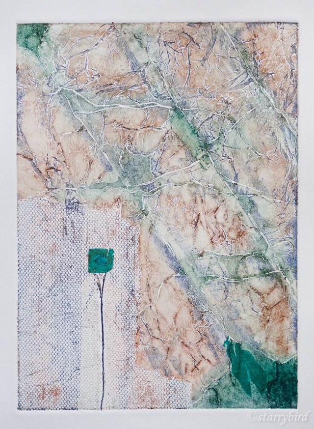
I decided to use coloured tissue to add colour and tone and to reuse the colours in my previous print to link to the previous print and bronze. The print was inked intaglio in red oxide and burnt sienna, wiped and then rubbed over with french blue and viridian. Again tissue was applied in several areas for rhythm.
The additional colours added interest but lacked tonal range.
Next I added more ink and areas of tissue but the balance of tone between the mesh and rock doesn’t work and the areas of tissue aren’t integrated into the design. I reinked with more ink in the mesh area and placing tissue just into the deepest crack areas. This has produced a better range of tone across the print and a better rhythm of colour.
Critique
I have used reference photos for inspiration and exploration into abstraction. I wanted to produce a print which would drawn the viewer into the texture and colour without any need for them to recognise the original subject.
The colours were again suggested by the patina and verdigris on bronze inspired by Hepworth’s work, and by the metal oxides in the rock face.
The success of the print depends on contrasts. The oranges and blues are contrasting colours and create an interplay of cool and warm colours. There is also a contrast in texture between the naturalistic ‘cracks’ and the man-made regularity of the mesh. The torn areas of tissue contrast with the regular square and hexagon. There is a wide range of tonal contrast across the whole print. The diagonal cracks contrast with the rectilinear lines in the metal.
I am concerned that the print lacks a single centre of focus but the areas of dark tissue and cracks do lead the eye around the print, rather than it gravitating to one point.
A collagraph plate develops as it is repeatedly inked which makes the process unpredictable but can also lead to happy, unexpected results. Inking at different levels is difficult to control and I am aware that I need a lot more experience to reliably achieve a desired result, but I am pleased to have created the interplay of colour, tone and texture in this print.
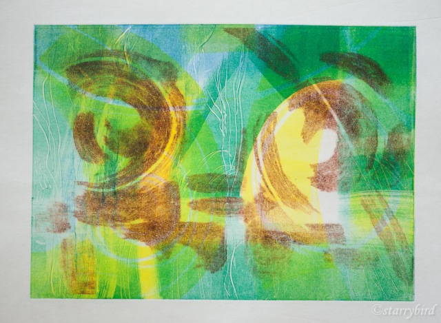
Print 4 – Hepworth’s Garden I
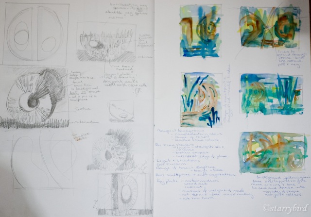
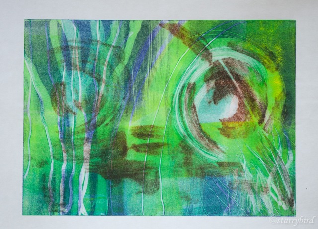
When researching combined print techniques, I worked at the work of Barbara Rae and how she uses creates layers monoprints, overprinted with etching or collagraph. It has exercised me how she overlays her vivid and contrasting colour combinations without producing muddy neutral colours. I had attempted my own version during the research and was keen to have another attempt at combining monoprinted layers with a carborundum ‘key’ print. Hepworth sculpture in the context of her green and leafy garden seemed the perfect subject.
I had a vague idea of what my initial background layers should look like having played with watercolour in my skecthbook, but I wanted to develop each one in response to the developing print. My final carborundum layer was loose sweeps of micaceous oxide brushed onto thin plastic, gently echoing the broad shapes of her sculptures, their plinths and the steps in the garden. These shapes were wiped to soften them and drawn back into.
In order to get thin luminous layers of ink, I wanted the most response from my paper, so I have used thin Japanese Hosho tissue which was left for 12 hours between damped tea towels.
I worked from light to dark with my background layers in complimentary colours and then printed the carborundum plate in a contrasting colour. I used the same colours as my previous two prints in the series, with the addition of yellow.
In my first attempt, I have drawn into the three background layers to suggest the foliage of the garden, and rollered areas and wiped to give tonal and colour range and to suggest areas of shade and sun. The carborundum print was intended to suggest bronzes seen through the foliage.
This didn’t quite create the feeling of vegetation, cool shade or mystery I was after. I replaced the yellow with a cool violet blue in the next attempt, and made more definite marks for the vegetation.
Critique
The idea for this print came to me almost in a dream, and it has a dream-like quality to it. I hope the viewer can feel the cool, calm peace of Barbara Hepworth’s garden with the massive bronzes glimpsed through the foliage.
The layers of complimentary colours, rolled on in different areas, wiped and drawn into to represent foliage, have produced areas suggesting of trees and plants, shade and sun. I was worried that overprinting these with a contrasting colour would produce a muddy neutral but the soft red oxide has retained its warmth. The very thin translucent layers were picked up by the damped Japanese paper as I had hoped, giving a luminous effect.
The carborundum plate was inked lightly and well wiped. I wanted no background tone on the plate to muddy the other colours, and the shapes were to be just suggested. I think it was a mistake to use two similar sized and shaped marks to the left and right of the plate. My original idea was that this would give rhythm and unity but they are too similar in shape although different in weight. I think, also, that the ‘gravity’ of the carborundum plate should be a little lower in the print.
The quality of a soft carborundum plate, over the monoprint with its mark making, is a pleasing contrast. Creating this spontaneously, responding to each layer as it was printed, was the ultimate in creative fun.
Print 5 – Hepworth’s Garden II
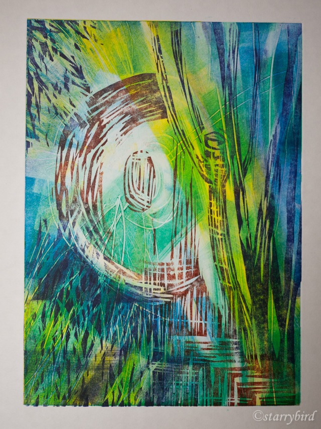
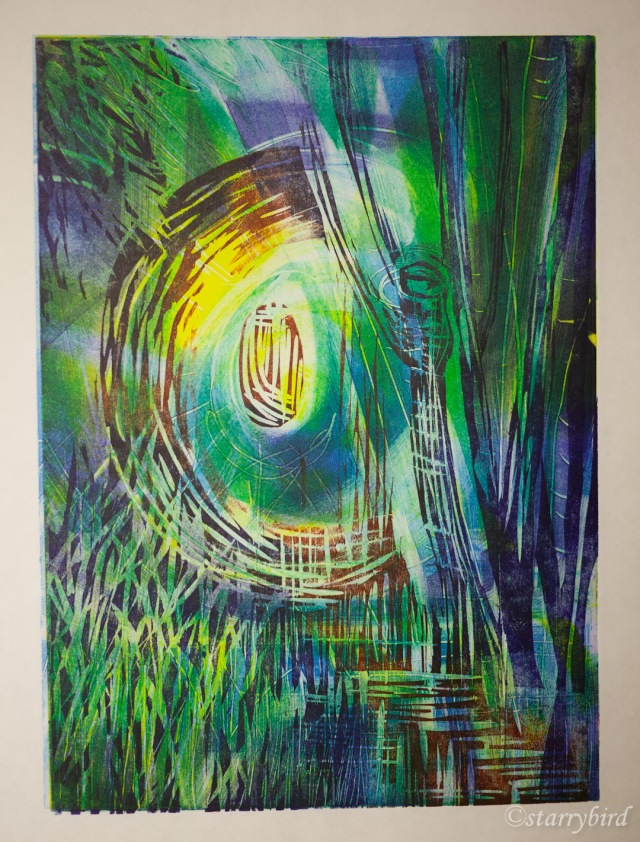
My final print continues looking at Hepworth’s garden, but in a different technique and with a greater emphasis on mark making. I wanted to give the print more structure. The background is four layers of monoprint colour but I have drawn into the ink more with cotton buds, crumpled paper and various sticks. My final layer is a woodcut. I was inspired to try this by the work of Gail Mallatrat. I have tried to create interesting marks which echo those on the monoprints but have a different, hard nature. I was very interested to see how this would affect the result compared to carborundum.
I have used the same colours as the previous print.
My first print was a complete hash up as I got the final plate the wrong way around and registration, therefore, wrong too, but it showed me where to go with my inking. My second print, informed by this, was so much better.
The monoprint layers were printed using light pressure in a press. The final layer was hand pulled. Five layers and two techniques made registration particularly challenging. My registration didn’t work quite so well with my third print, but I like the mark making and tonal balance of this best.
Critique
My final print continues looking at Hepworth’s garden, but in a different technique and with a greater emphasis on mark making. I wanted to give the print more structure. The background is four layers of monoprint colour but I have drawn into the ink more with cotton buds, crumpled paper and various sticks. My final layer is a woodcut. I was inspired to try this by the work of Gail Mallatrat. I have tried to create interesting marks which echo those on the monoprints but have a different, hard nature. I was very interested to see how this would affect the result compared to carborundum.
Five layers of ink in different colours have produced a richly coloured print. The addition of many more marks and the hard edged woodcut have created a different feel to the previous print. The atmosphere is less dreamy, more representational and dramatic. I think that perhaps the layers of mark making are a little too chaotic in places.
Making sure that I left plenty of white space in each layer has ensured that the colours all sing and that a good range of tones is produced.
The sculpture is much more clearly stated in this print. Smooth, subtle curves were hard to cut against the grain of the wood, and the shape is clumsier than the carborundum print. In the rest of the print, I would also have liked to make more jagged, organic marks than I managed.
I think these techniques work really well together and allow for a complex interplay of colour though positive and negative shapes. The many layers and variation in tone evoke the sense of a three dimensional environment; I want the viewer to imagine standing in the cool shade in Barbara Hepworth’s leafy, treed garden and seeing, though the vegetation, the warm sun striking a bronze in a clearing.


I think your work is stunning! I love the texture you have achieved. Your work has a sense of mystery and mood that feels transcendent.
Gosh! Thank you so much!
Thank you, so glad you like it!
Amazing work! Very interesting to follow your development and critique of the work.
Really inspiring project. It’s giving me ideas for starting my final project about Buxton. Thank you