Final Course Reflection

Printmaking 1 has been a hugely enjoyable and rewarding course. I have been introduced to new techniques and developed techniques with which I was already familiar. I have improved my working practice as the course has progressed, especially in the areas of registration, presentation and conceptualization of ideas. I think my work took a quantum leap forward in content following a change in tutor. My new tutor challenged me “to consider the subject for a print more and …broaden my imaginative ambition for a print”. I addressed this by creating my own projects, one around research into the works of Morandi, one looking at metal working and a project based around Hepworth’s garden and St Ives. This way of working brought much more structure to my approach to sketchbook work and created prints with a much greater depth of meaning.

Review Against Assessment Criteria

Demonstration of Technical and Visual Skills

Throughout the course, I have tried as many materials and techniques as I could access. I have, for example tried copper sulphate etching, drypoint and contemporary woodcut and traditional Japanese woodcut. Looking in depth at a particular subject has certainly improved my design and compositional skills.

Quality of Outcome

As I discussed above, I feel the quality of outcome improved immensely when I started work within a structure of research into a particular artist or subject rather than thinking in terms of technical exercises. This allowed me to think more coherently, present my thoughts better in my sketchbook and produce better thought through bodies of work. I have also worked hard on improving the presentation of my prints, keeping them clean and improving my registration. Participating in a print exchange and in a joint exhibition challenged me to produce prints to the very highest standard I could achieve.

Demonstration of Creativity

Throughout the course, I have sought to be as experimental as possible.  I have, for example, printed on fabric and bark, made my own ink, created my own chine colle papers and incorporated digital images. I have produced an artist’s book, printed a hexiflexigon and embroidered a print on fabric. It is my ambition to push my printmaking out of a rectangle on paper and into 3d work or installation. I have been very excited by the richness of surface that can be achieved by combining techniques, including digital printing, and I can see great scope for my future development in these areas.

Context

I have tried to reflect constructively and critically on each print as I have progressed through the course, but I can see that my research and critical thinking have really developed in response to the challenge proposed by my second tutor.  The clearer view I have of the context and my ambition for a print, the clearer my critical reasoning has become.

Conclusion

This course, and in particular the input from my second tutor, has given me great ambition for my future printmaking practice and equipped me a set of tools to move forward.

Posted in Critical Reflection, Part 5 Combining Print Techniques, Printmaking 1, Reflection, Uncategorized | Tagged , , , , | Leave a comment

Being Brave – Exhibiting

One of the great benefits of being a printmaker, as opposed to a painter, say, is that we often come together to work in an open press situation and therefore readily form part of a practicing community. During my course, I have used several presses and attended three or four workshops which have not only provided me with new skills and insights but also a network of fellow printmakers.

I was reintroduced to printmaking a few years ago at a workshop at our local museum which has a Rochat press situated in a restored Edwardian studio. Now a group of printmakers regularly meets up to use the press and explore new techniques and I was delighted to be invited to join them in their annual exhibition, even though I only occasionally use the press. I enjoy exhibiting because it gives me an opportunity to get my work out there and I find it very pleasant socially. It makes me raise the bar on the professional standard of my work, especially as several other members of this group are professional artists.

Frobisher private smaller (1)

The exhibition is in the foyer of a local library which is very reasonable to hire and has a decent public foot fall. We were each invited to exhibite 10 framed prints with others in a browser. The work had to be for sale and so I was unable to include many recent prints since the best of these will be sent off for assessment and I only wanted to exhibit my best work. I therefore submitted some older prints and some done during this course, where I had a decent edition and could retain some.

I framed the prints myself. I attended a professional training course because the cost of framing for exhibitions is so high if the frames are bespoke for the works. I don’t like work which has been shoehorned into a cheap off-the-shelf frame of the wrong size. It also gives me absolute control and means I can have a ‘house style’ consistent over time. All my prints are framed in natural wood,  limed white.

exhibition (1 of 5) exhibition (2 of 5)

In advance of the exhibition, I planned my hang by drawing out my alloted space of the floor and working out positioning. However, at the real hanging, my space was completely different  in both size and shape, and a new arrangement had to be arrived at on the fly.

As part of my contribution to the organisation, I prepared sheets on the history of the studio and press, and a description of the various printmaking techniques. In particular, I wanted to explain how a fine art print is different to a giclee or photographic print.

exhibition (1 of 1) exhibition (4 of 5) exhibition (3 of 5)

I have found participating in this and other local exhibitions really rewarding. It is great to see my work hung and being looked at.


Posted in Critical Reflection, Printmaking 1, Reflection, Study Visits and Exhibitions | Tagged , , , , , , , , , | 1 Comment

Rembrandt Exhibition

The exhibition at the National Gallery of Rembrandt’s later works from 1659 onwards. This was a time when Rembrandt was no longer fashionable and he was facing increasing difficulty obtaining commissions. He had overstretched himself financially, borrowing heavily to build a large house and investing in a wide ranging art collection. His wife, Saskia had died, leaving him looking after their young son, Titus.

The premise of the exhibition is that, as Rembrandt’s fortunes waned, he showed no signs of compromising his painting style to the then fashionable, polished and detailed style, and he created works which said far more about the human condition.

The exhibition includes two paintings representing Lucretia, a roman woman who, according to Livy,  committed suicide rather than face the shame of having been raped. In the 1664 painting, she stands poised to thrust a dagger into her abdomen, but her red rimmed eyes are fearful, unresolved, agonised and her hands war with each other, one ready to thrust, one almost beseeching. Rembrandt captured an emotion which goes far beyond the usual historical or mythological painting of the time. Loss, sadness and regret were clearly emotions he understood.

He revisited the subject in 1666, by which time his model and mistress, Hendrickje Stoffels, had also died. This time he departs even further from the usual painting conventions and shows Lucretia dying, not artfully draped over a bed or drooping into someones arms, but standing, her shift soaked with blood, deathly pale. She stands confronting the world, reproaching us all for the dreadful position she has been put into.

Both these paintings demand that we engage with Lucretia’s feelings.

As his life descended into tragedy and increasing financial chaos, Rembrandt’s works become  more expressive of human frailty and emotion and his brush work became freer and more inventive. He used a wide variety of marks in any one painting, indeed, on one forehead, and in the two Lucretia paintings, one can see where he has used the palette knife to create decoration in the fabrics, for instance on the sleeves and lay in broad sweeps of colour in the skirt. His exhibition credits him with probably being the first artist ever to manipulate paint directly in the canvas with a palette knife.

He died in 1669, relatively young at 63, worn out by hardship, but still at the height of his creative powers.


Posted in Printmaking 1, Study Visits and Exhibitions | Tagged , , , | Leave a comment

Part 5 Gallery


Posted in Part 5 Gallery, Printmaking 1 | Tagged , , , , , , , , | 3 Comments

Project 15 – Four Combination and Experimental Prints

For the final project in the course, I had a number of ambitions:

  • to continue to look at the subject of iron smelting and casting
  • to use my own created chine colle papers
  • to combine monoprinting with carborundum printing, inspired by Barbara Rae
  • to explore the subject of Barbara Hepworth’s sculpture and garden and St Ives which I had recently visited
  • to move towards abstraction
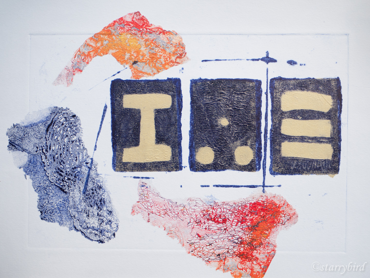
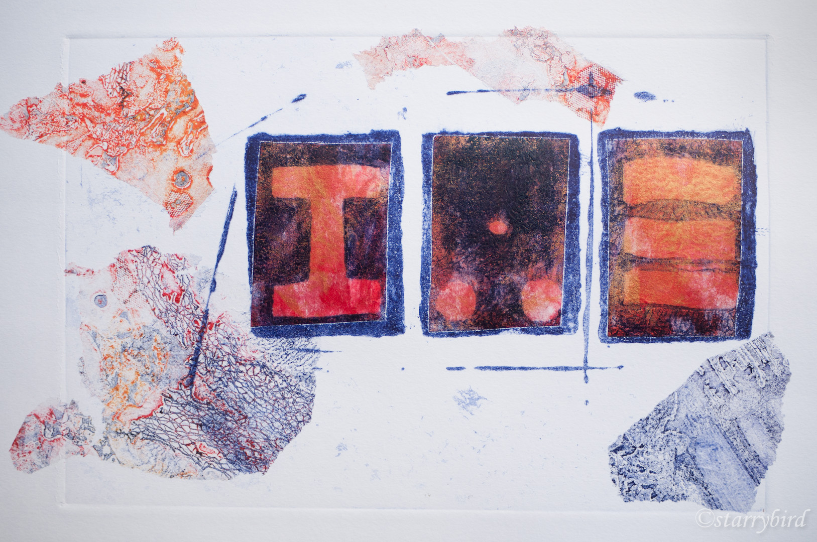
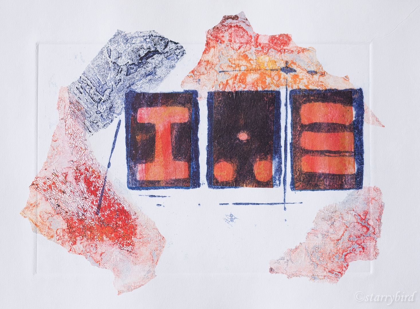
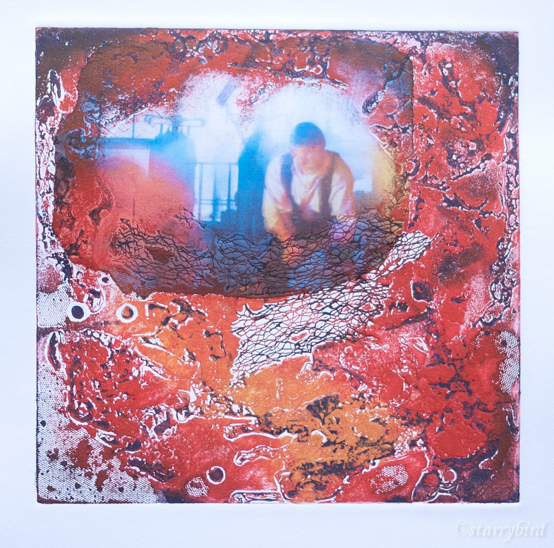
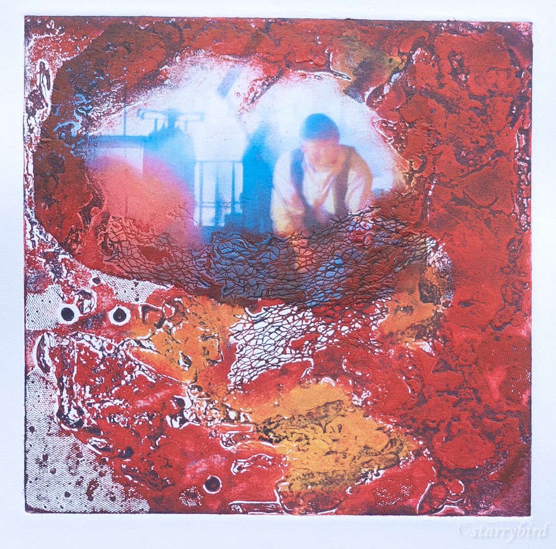
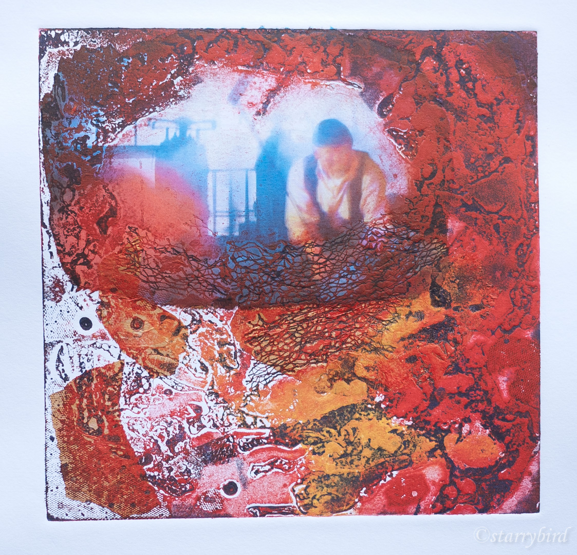
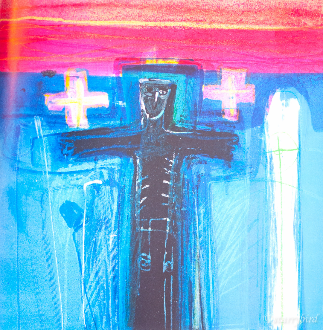
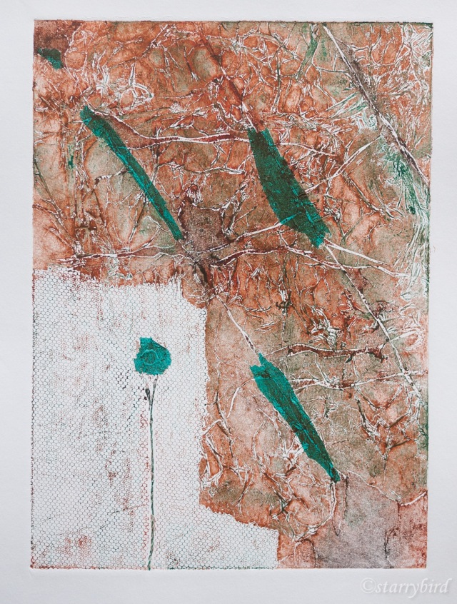
Print 1 – Cast Iron

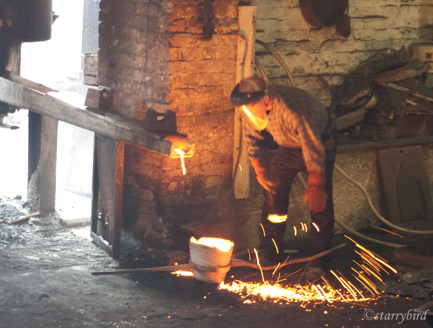
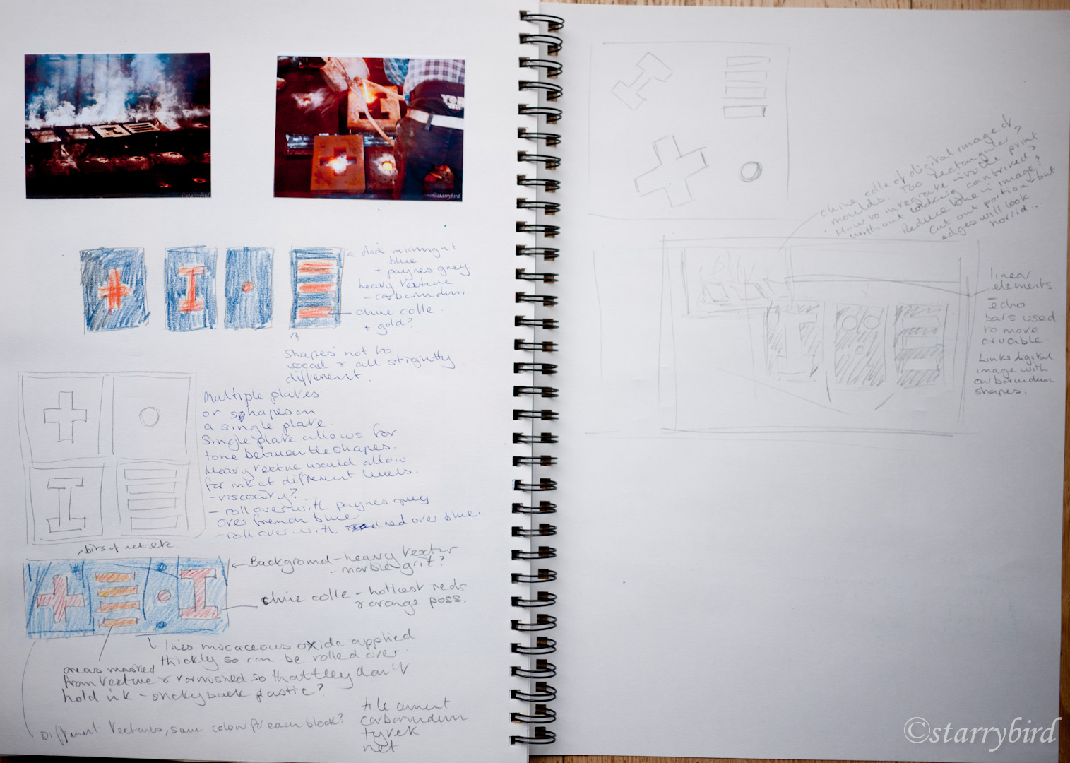
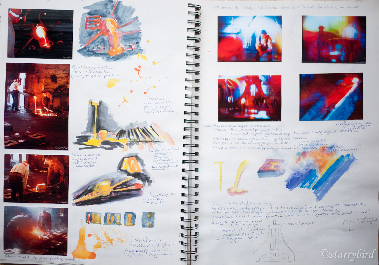
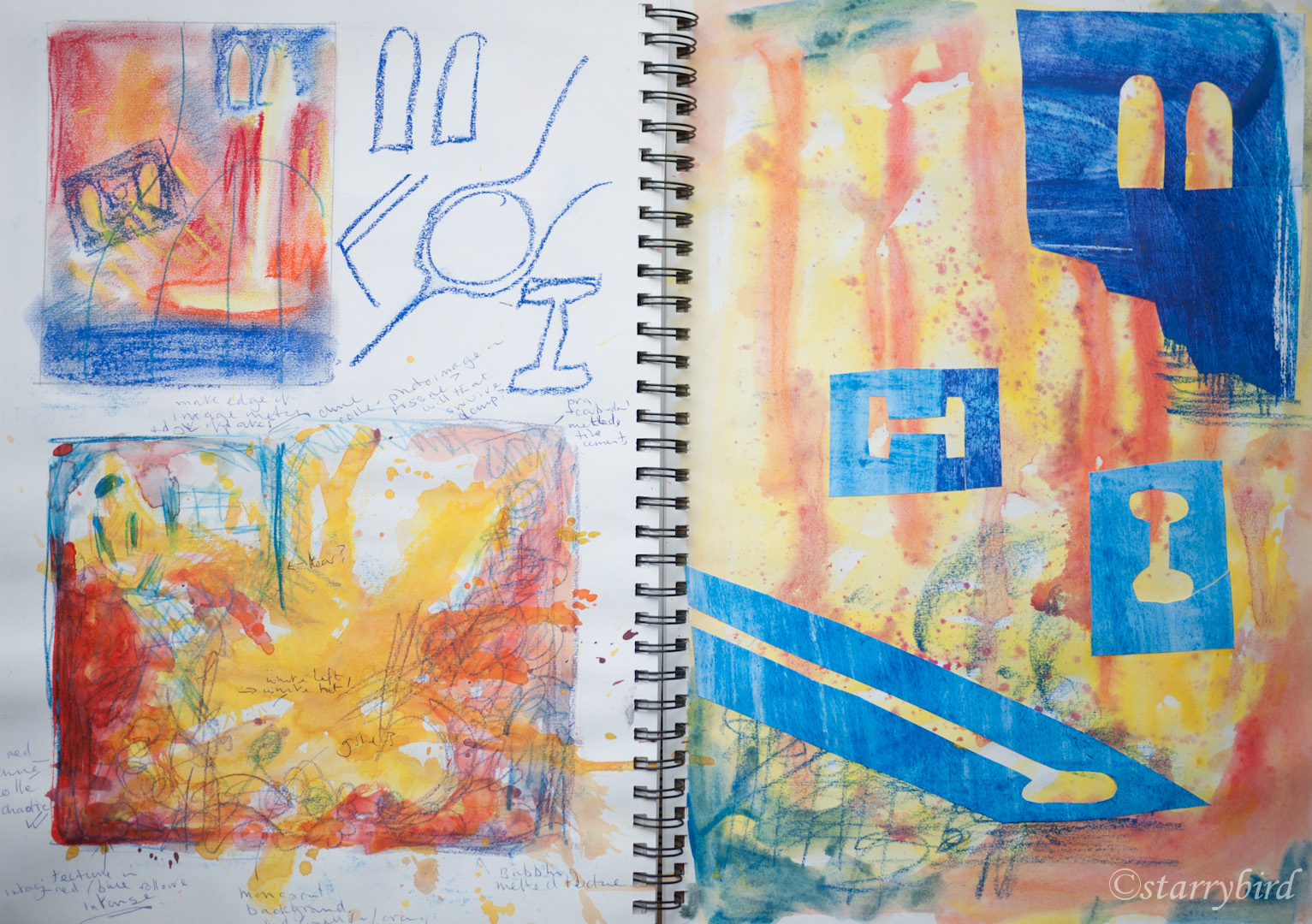
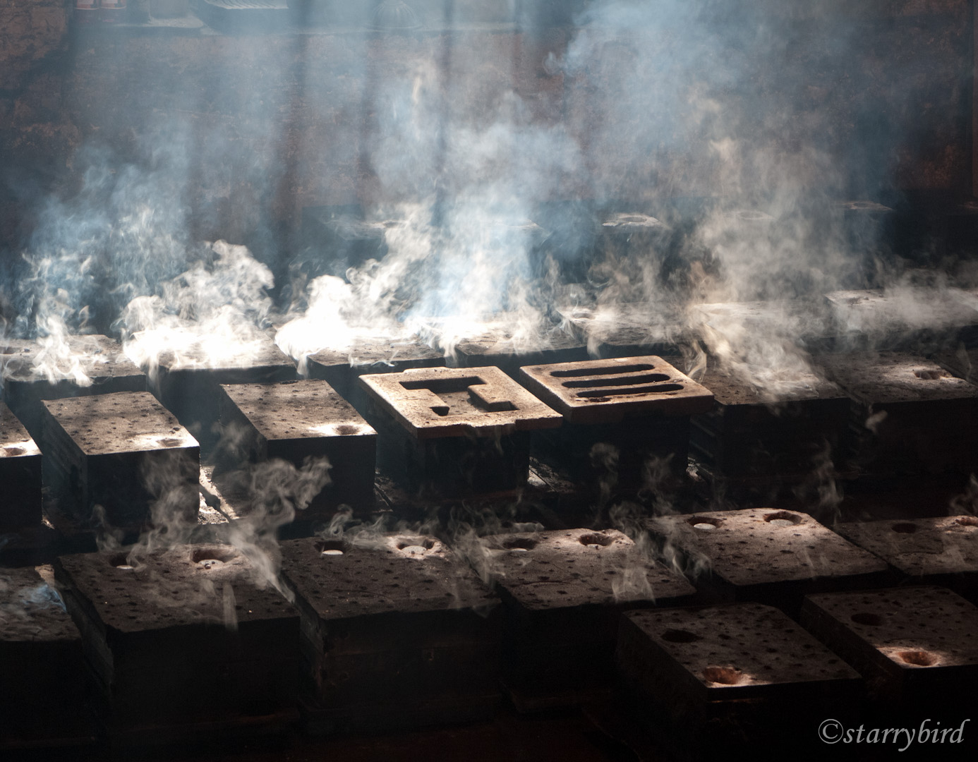
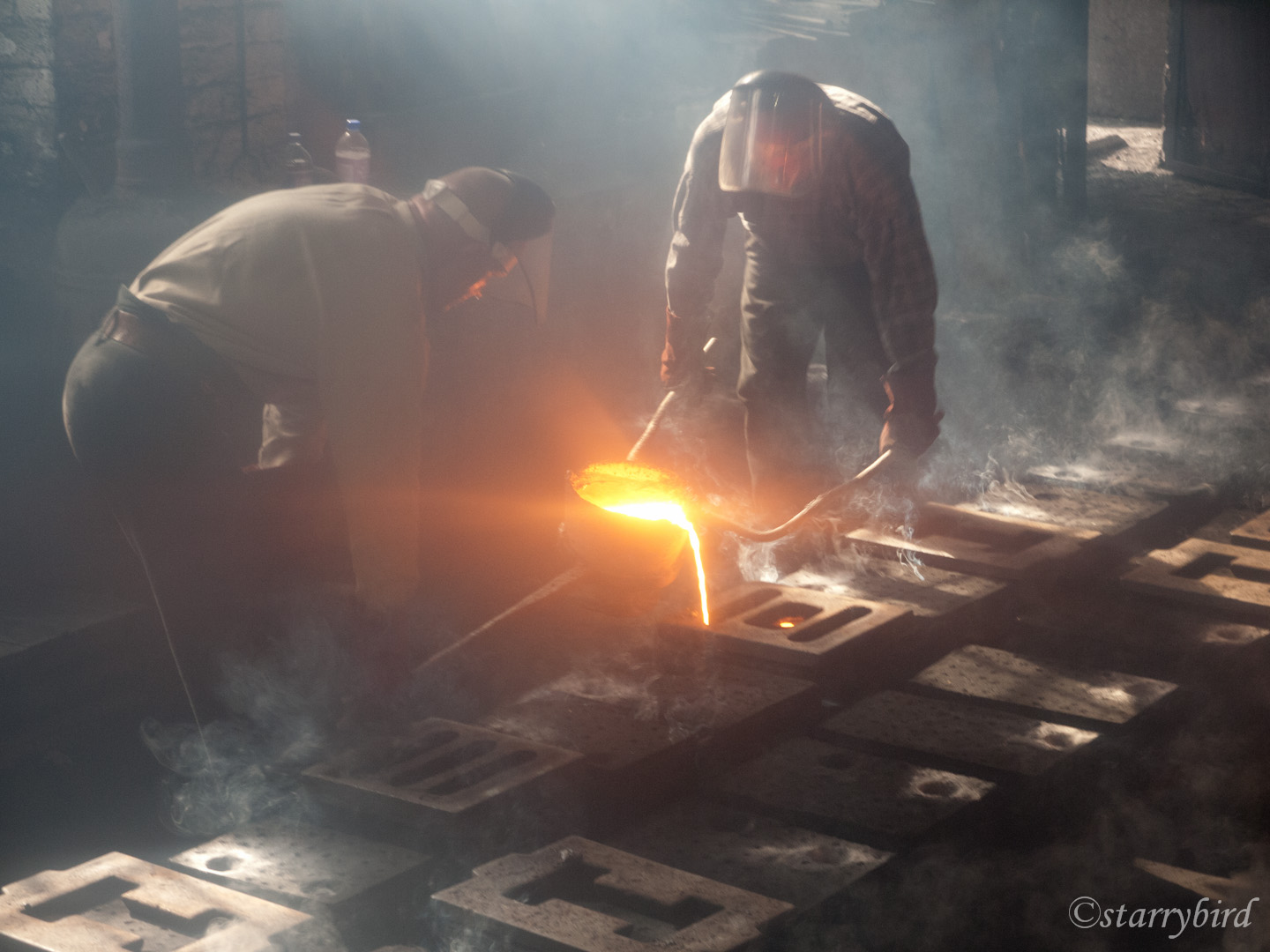
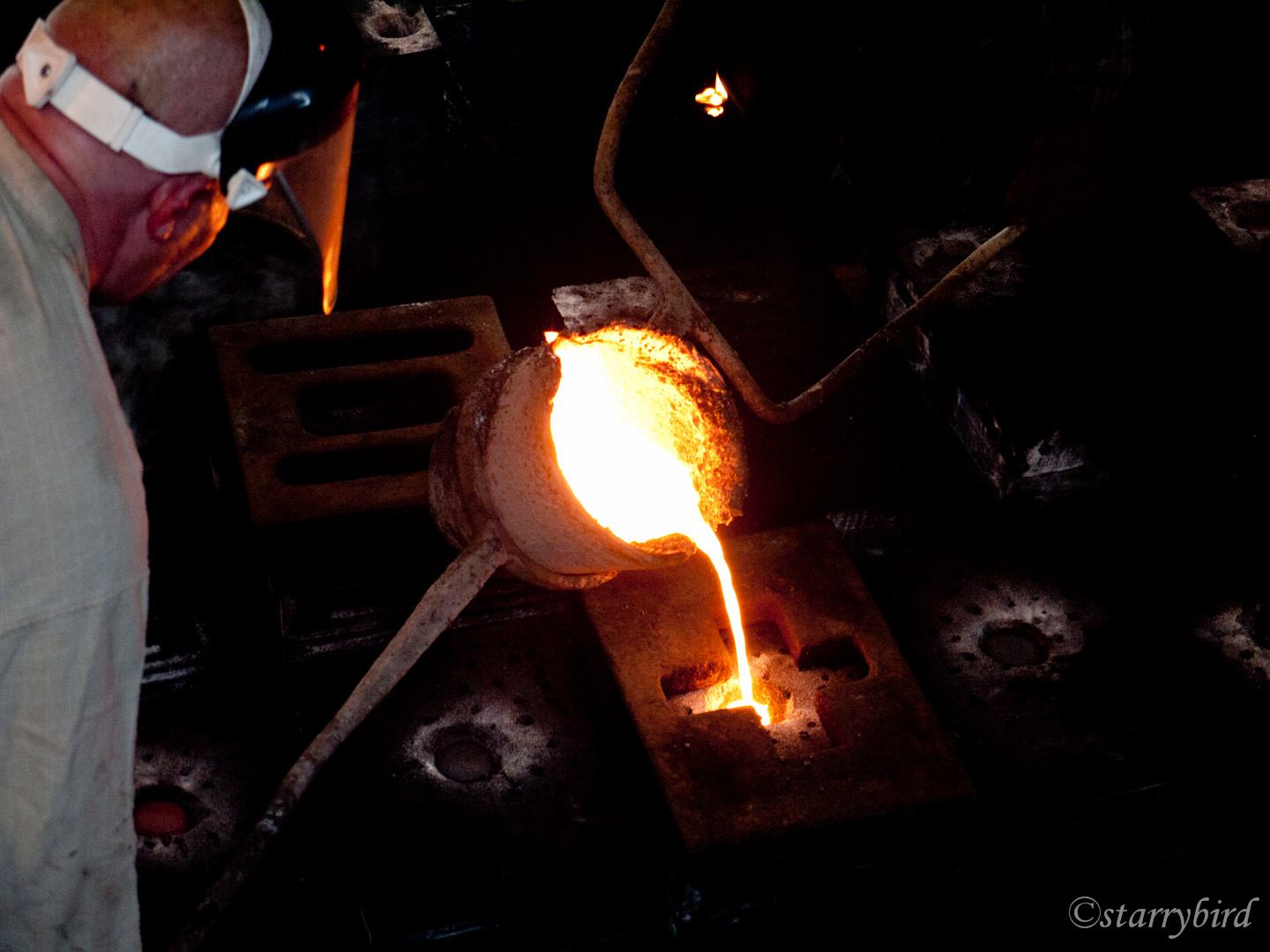
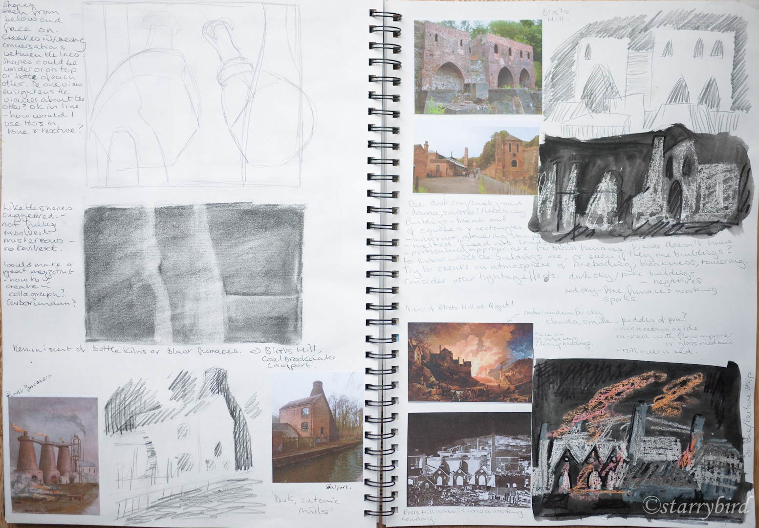
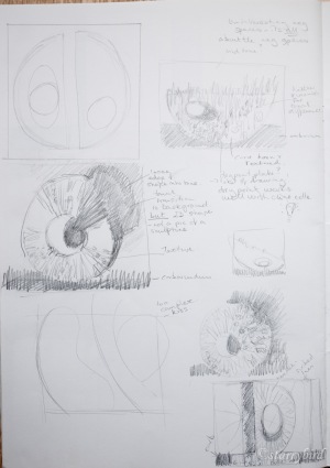
I wanted to continue exploring the process of casting iron and trying to represent it in a abstract form. In my sketchbook, I had looked a various shapes involved in the processes, the steam hammer, the crucible etc and fixed on the shapes of the molds for this print.

coalbrookdale (10 of 26) coalbrookdale (12 of 26)

part 5 (15 of 19)

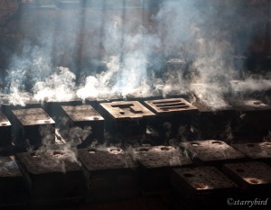
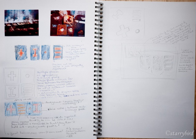
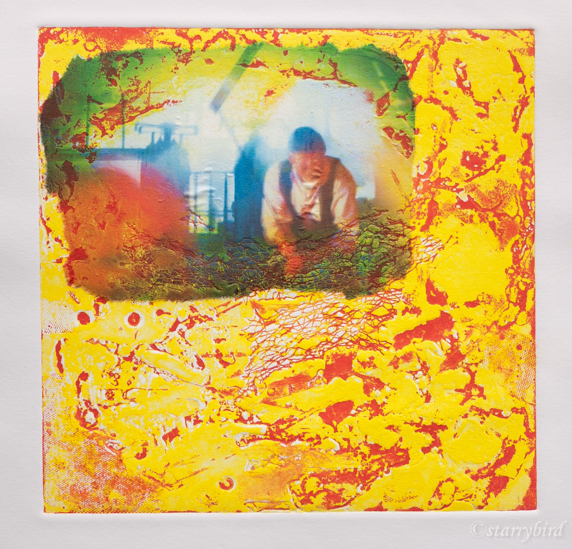
I considered using a digital image, either of the metal being poured into the molds, or of the smoke rising from the hot molds, combined with carborundum shapes representing the various molds. Playing about with cut outs and small photos, I couldn’t arrive at an arrangement which satisfied me. However, when printing my previous ‘Alchemist’ plate, I had run the plate through the press with tissue paper to clean it between prints, and this had created some interesting tissue which I could use for chine colle.

To create my plate, I covered a board with sticky back plastic, for wipability. My basic shapes where cut from card, painted with micaceous oxide acrylic paint (like carborundum) and stamped on the plastic. This created shapes with some texture but also not too exact. I also painted some card edge and sticks and created some linear shapes which echo the shapes of the bars which lift the crucible and which I  hoped would help link the elements of the print.

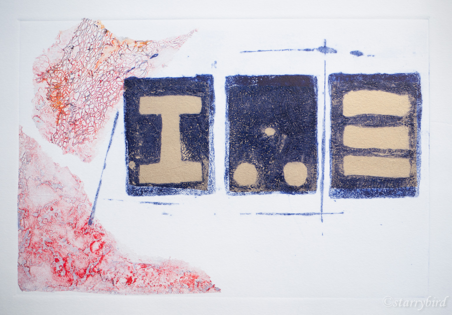
I tore my printed tissue into rough shapes to evoke oxidised bloom, a waste product of iron working. Gold tissue was also used to provide the molten metal in the molds. This was cut sufficiently generously to give a shimmer to the whole of each mold shape.

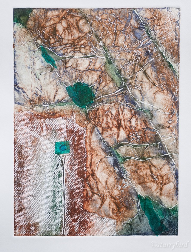
In my initial prints, I was too sparing of the printed tissue. I also didn’t like the relationship between the plate edge and the tissue edge.

alchemy (4 of 7)part 5 (74 of 57)

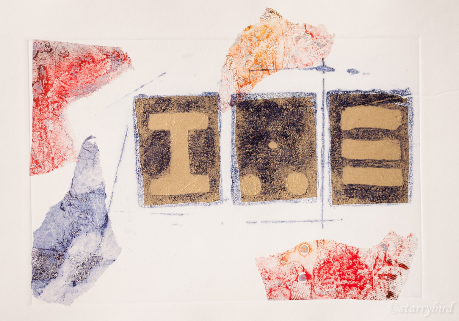
I reprinted with more pieces of tissue, placed to overlap the plate edge.

part 5 (30 of 57)part 5 (73 of 57)

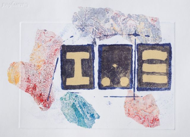
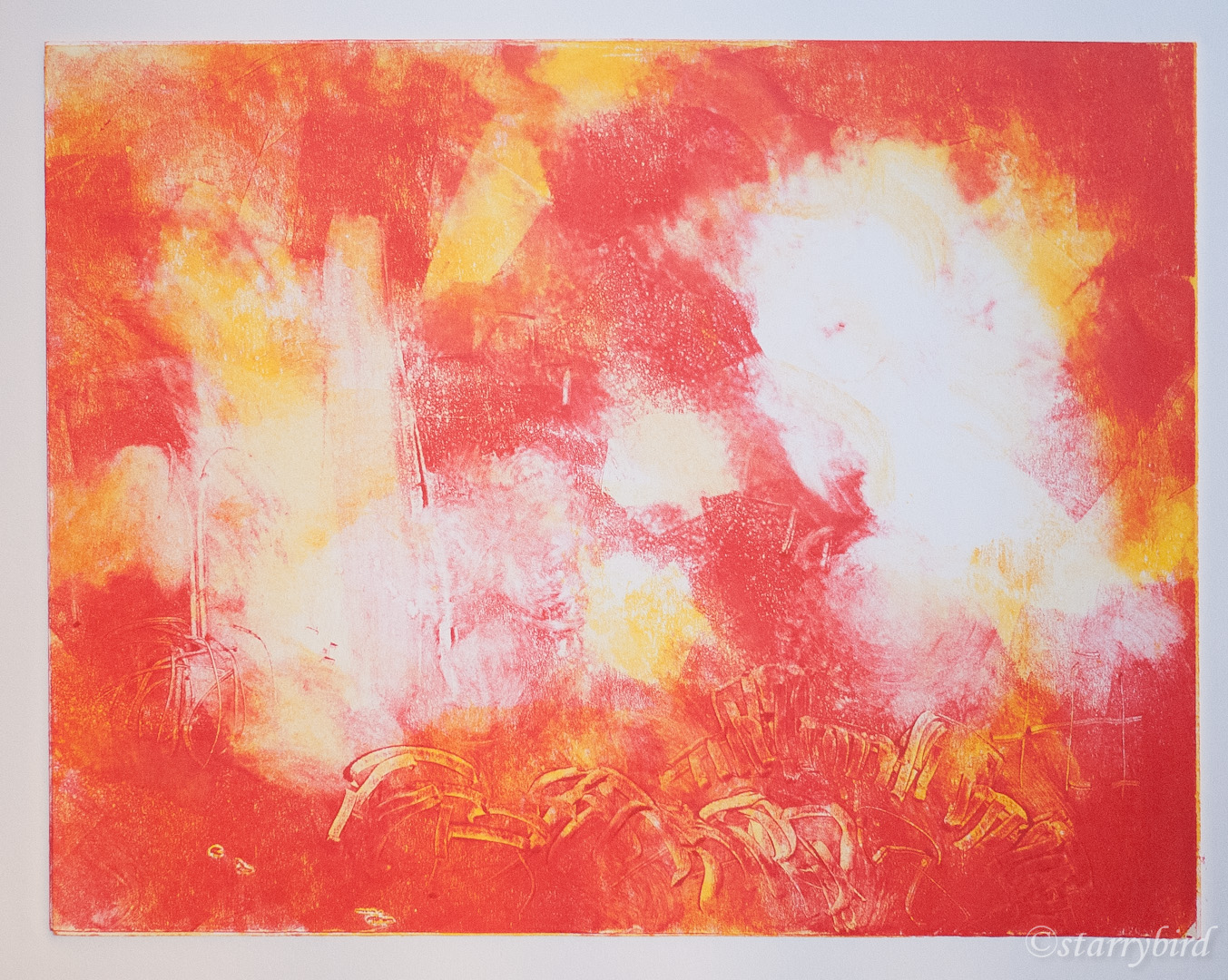
I felt the gold was a little too cool, so created a tissue paper in reds and gold by monoprinting onto tissue using a gelliplate and acrylic paint.

alchemy (2 of 7)

The monoprinted tissue showed a slight, white halo in the molds, so I have softened this with a tiny amount of watercolour.
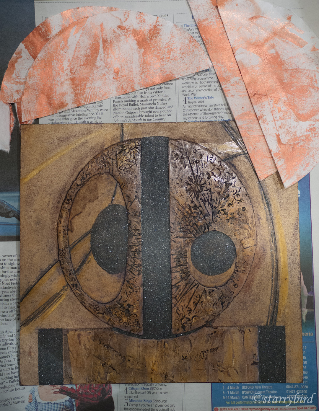
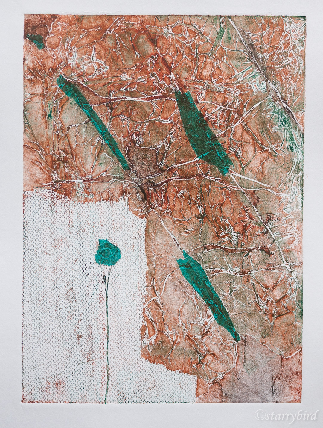
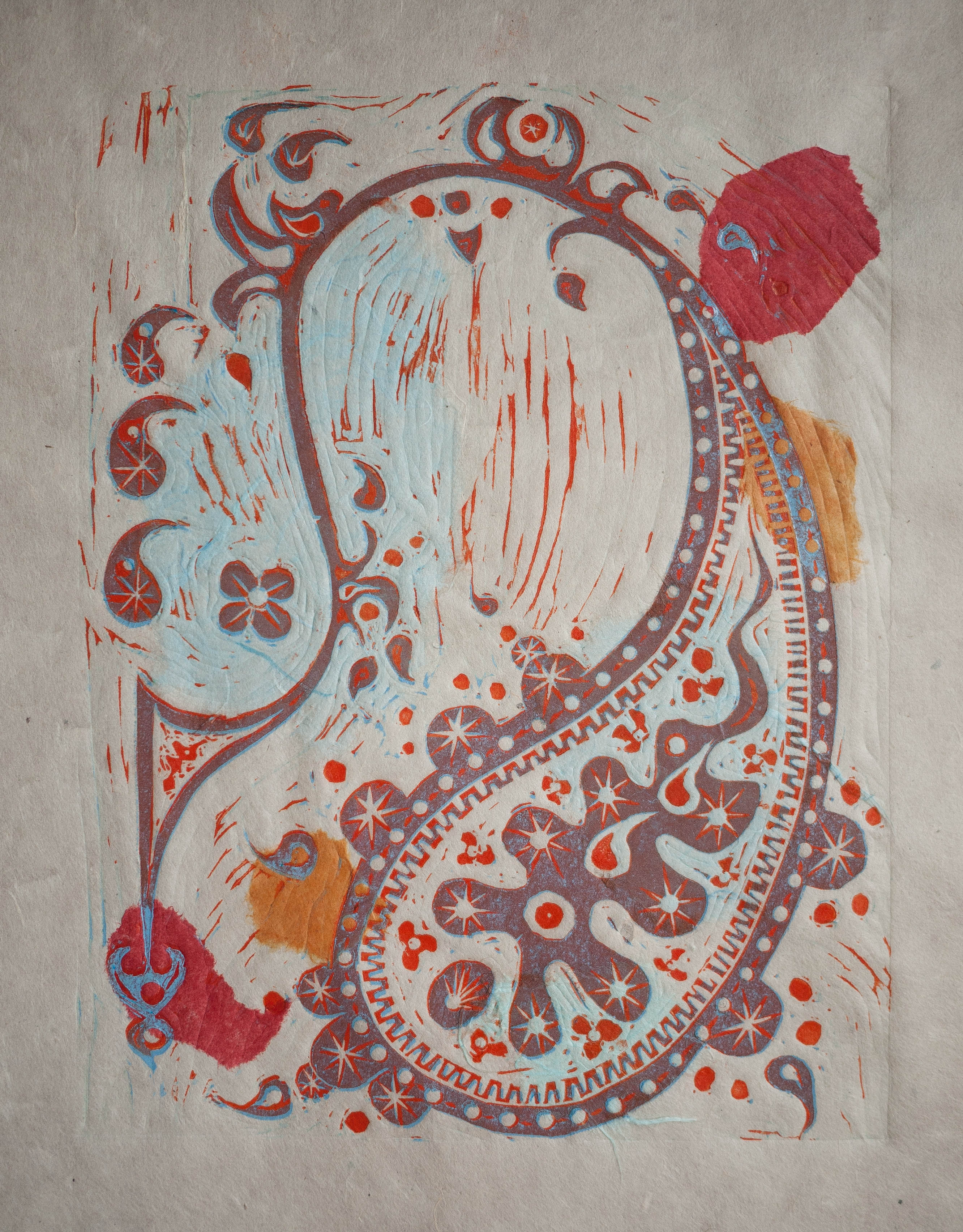
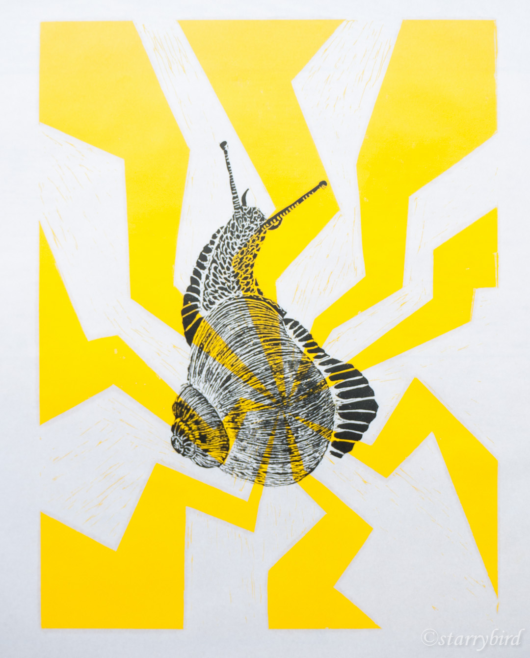
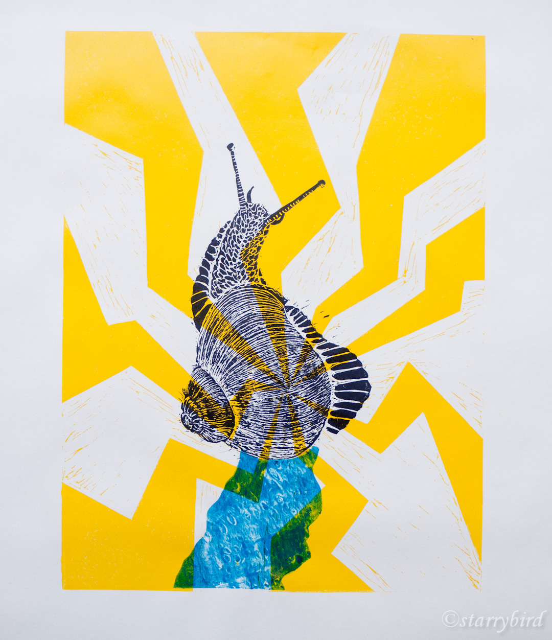
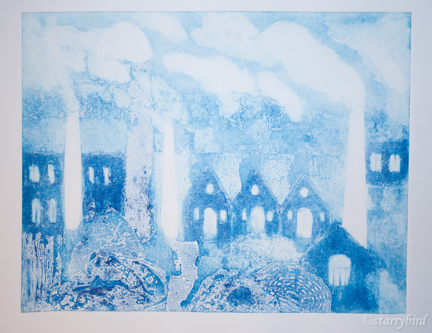
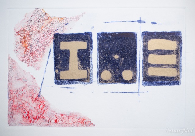
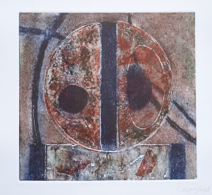
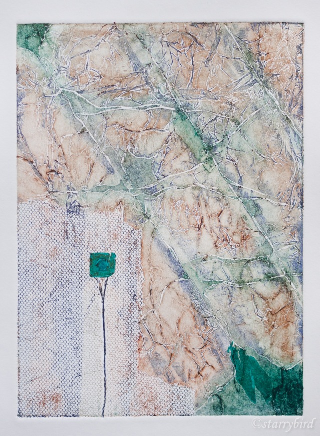
part 5 (2 of 19)

Cast Iron

Critique

Throughout the project looking at iron founding and casting, I have strived for increasingly abstract representations, and am pleased to have finally ended with a print which is almost completely abstract. The strong, simple shapes of the molds are offset by the linear elements and the irregular, textured chine colle shapes.

I could have filled the plate with chine colle and created a solid background, but I think the irregular shapes are more interesting and leaving areas of white support provides quiet areas for the eye to rest.

The lines help lead the eye around the shapes and add interest to the negative areas. Overlapping the chine colle with each other and the main shapes also helps unify the print. Extending the tissue outside the plate edge breaks up that hard edge and avoids the usual rectangular print format. I hope the viewer will find their eye going to each of the shapes and finding interesting, contrasting  areas of colour and texture.

Making my own papers means that the constituents are all archival.  I think the three monoprinted rectangles are an improvement over the gold tissue, but left a slight white halo and I am disappointed with having to fudge these edges with watercolour. Hand colouring can often look contrived but hopefully it is in-obvious here. The tissue was positioned a little too far to the left on two of the shapes, leaving some white inside the molds. This is just part of the character of this print; I wouldn’t wish to use watercolour to disguise this. Positioning the glued papers on the plate with precision is really difficult. My support has creased slightly at one edge going through the press, due, possibly to uneven dampness or uneven pressure across my reclaimed mangle rollers. If I were starting again, I would use Somerset paper rather than Snowdon.

I have really enjoyed exploring this theme in different ways by creating a linked series of prints.

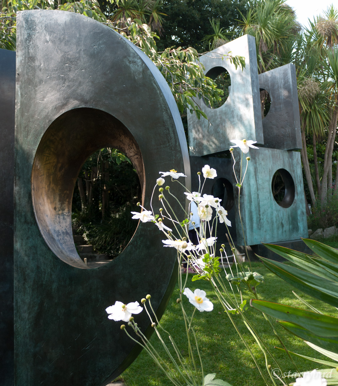
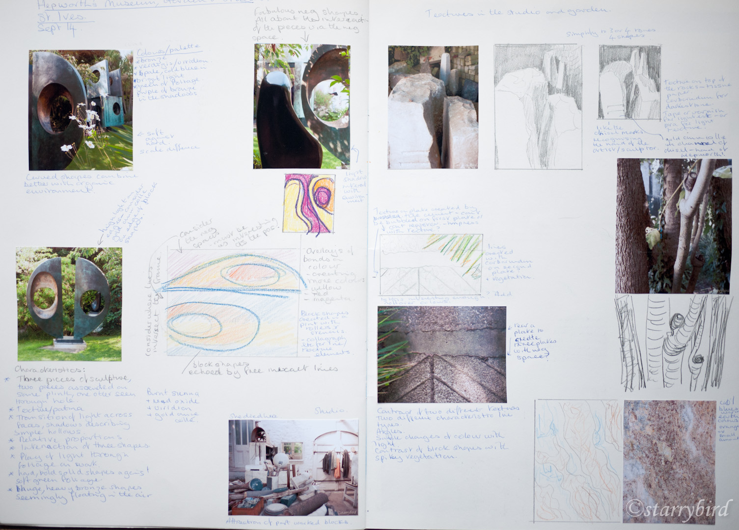
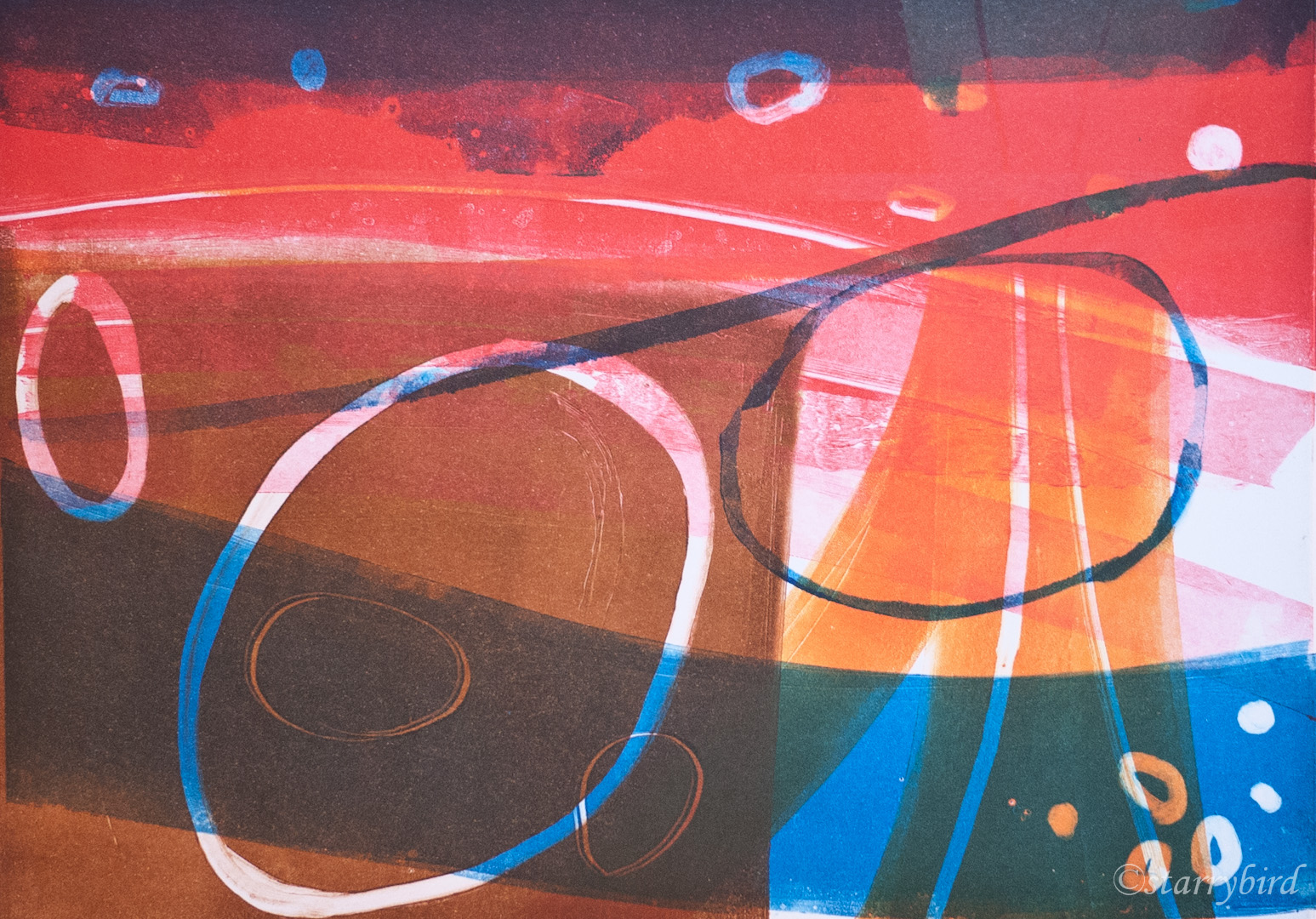
 Print 2 – Homage to Hepworth

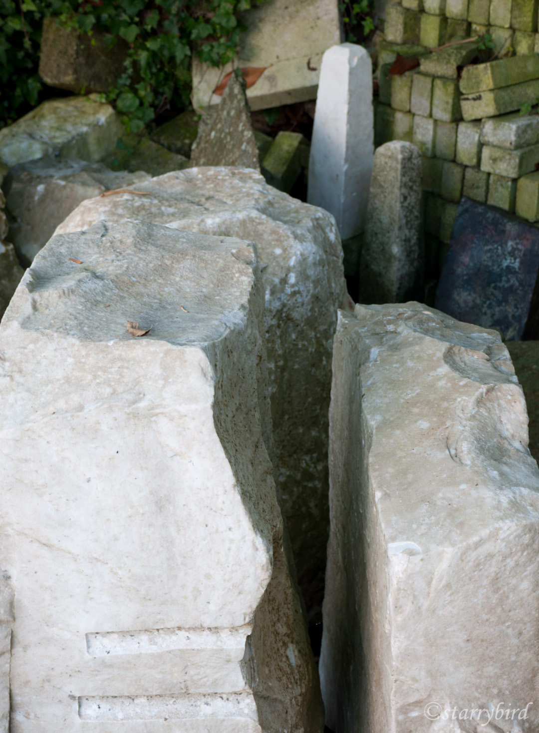
I recently visited St Ives, the highlight of which for me was Barbara Hepworth’s house and in particular the sculptures in the context of her garden. The garden and studio had lots of shapes and textures which inspired me and I took lots of reference photos with the specific idea of developing a series of prints. This was extended to other textures around St Ives especially in the sea walls.

st ives textures (10 of 24) st ives textures (11 of 24) st ives textures (12 of 24)

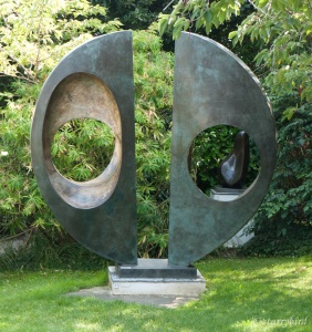
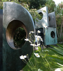
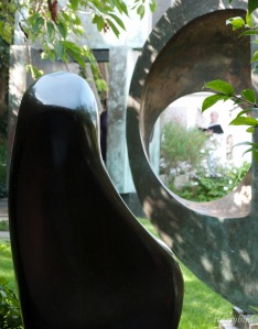
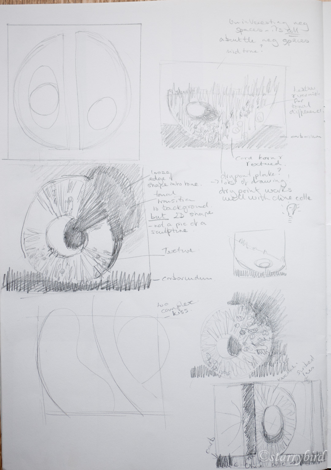
My first response to the reference material was to look at the shapes of the sculptures in the garden.

part 5 (17 of 19)part 5 (19 of 19)

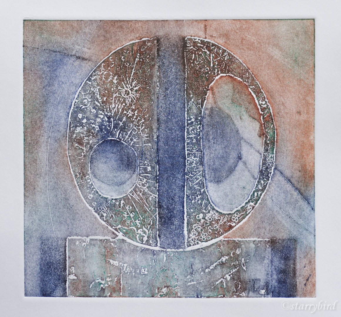
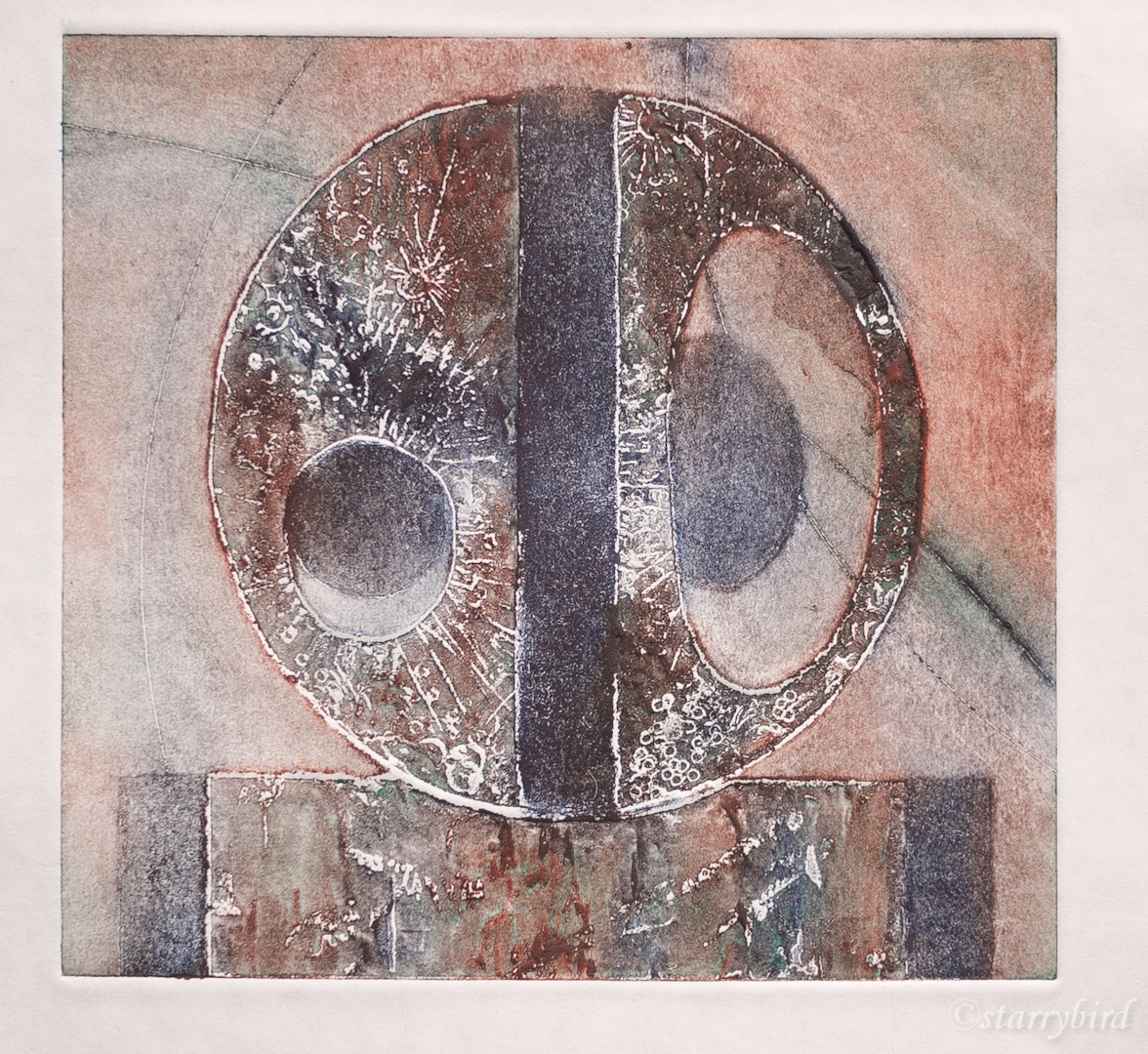
I tried all sorts of ways of cropping the shapes, extrapolating the curves, focusing on the negative space, but in the end I chose a simple representation in homage of one bronze. I created a collagraph plate using carborundum and tile cement. The original sculpture is smooth but I have created texture inspired by the moon, suggested by the circles and ellipses. This would allow me to ink and wipe at different levels, increasing my colour range. I also hoped to include some bronze coloured chine colle and the texture should provide areas where it would show through as a patina. Drypoint  lines  and swipes of varnish were added to vary tone in the background.

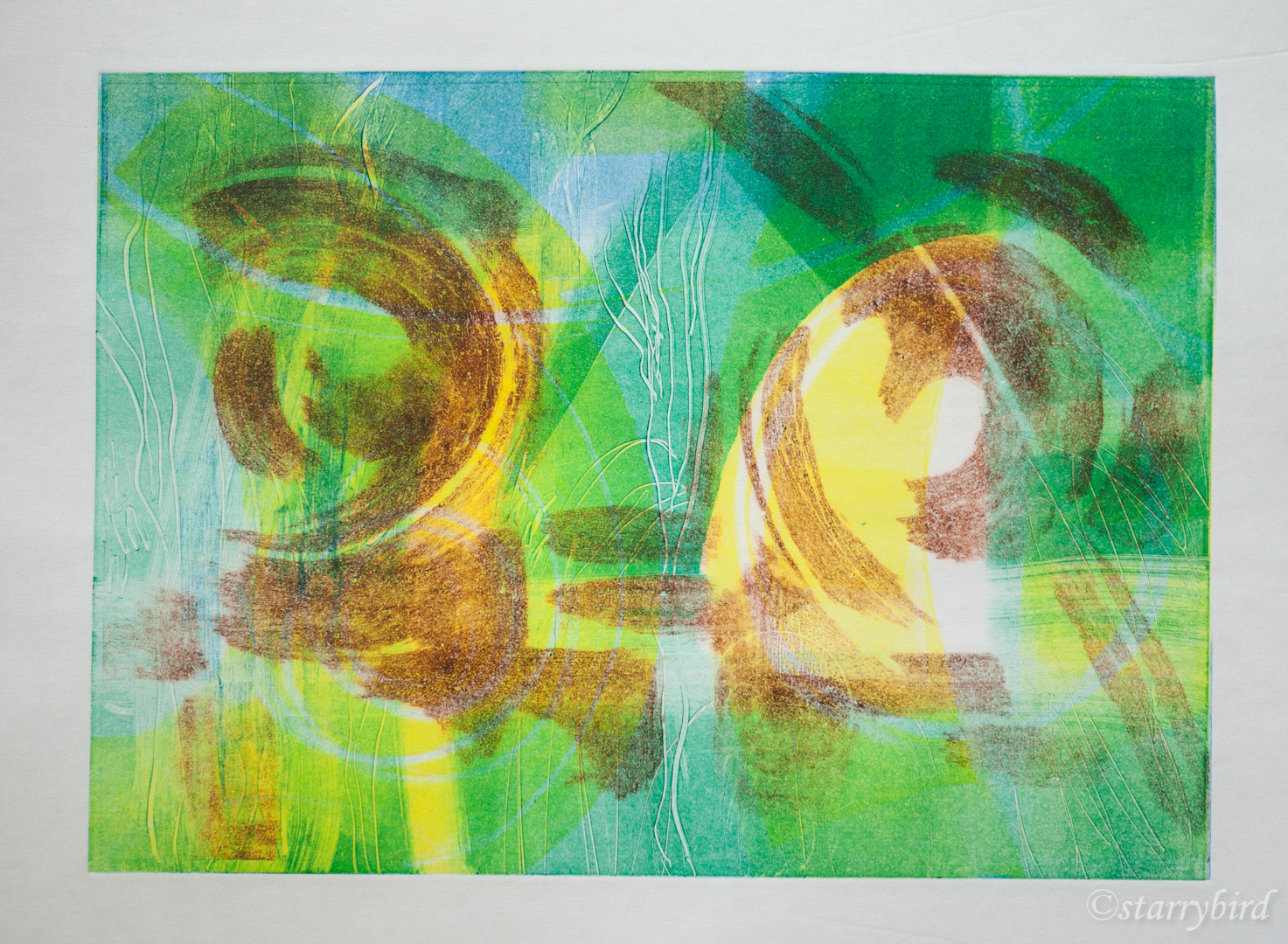
The print was initially printed without chine colle to explore inking techniques.

sculpture (6 of 7)sculpture (2 of 7)

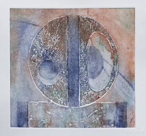
A circle of tissue painted in copper acrylic was then applied.

sculpture (3 of 7)

The ink didn’t take very well over the tissue, leaving the copper too dominant. This photo flatters the print. I decided that the copper needed to be more subtle and less uniform, so I monoprinted some tissue with very thin layers of copper paint. I also thought two pieces of tissue would be an improvement and I  reinforced the areas of carborundum which were wearing.

sculpture (1 of 7)

Plate with waiting monoprinted chine colle

sculpture (4 of 7)

The inking here is too weak, leaving the copper still too dominant.

sculpture (7 of 7)

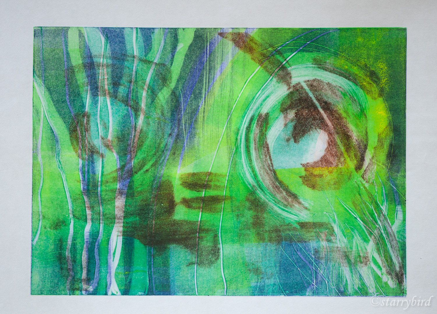
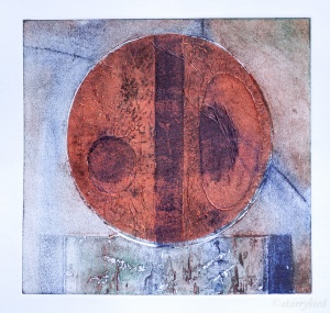
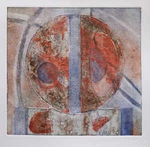
This has given a better tonal balance but the effect is rather crude and heavy handed. I am not convinced that the chine colle adds anything. On reflection, I think the initial prints employing colour rubs, in the manner of Brenda Hartill, are the most effective and subtle.

sculpture (2 of 7)

Selected print

Critique

This print was inspired by sculpture by Barbara Hepworth in her garden in St Ives.  A collagraph plate was chosen as the technique because of the sculptural quality of tile cement used for the main shapes. Areas of tonal contrast were created with carborundum and locally applied swipes of varnish, which also created linear shapes in the background along with drypoint lines.

The main shapes were textured, inspired by the lunar landscape suggested by the circular and elliptic forms. A textured approach was chosen to allow inking at different levels and the use of coloured rubs, in the manner of Brenda Hartill. The curved lines in the background also relate to lunar orbits, adding interest to the design, but I would have liked them to print just a little darker. I find the inspiration of astronomy creeping into my work almost unconsciously.

The raised edges of the tile cement were sanded to try and reduce any white halo around these shapes, and whilst this did work to some extent, the slight white halos are a positive addition to the print, adding tonal variation and a three dimensional effect.

The colours were chosen based on the patina of bronze and I had hoped to include bronze chine colle, but, in the final analysis, the more subtle effect of colour rubs produced the more interesting print.

Whilst the design has drawn very heavily on the sculpture of Barbara Hepworth, which I would always wish to acknowledge, I think the print stands on its own as an abstract design and the viewer does not need to be aware of the inspiration or the subject. I hope they are drawn into the calm relationship between the simple shapes and lines and the subtle texture and colour.

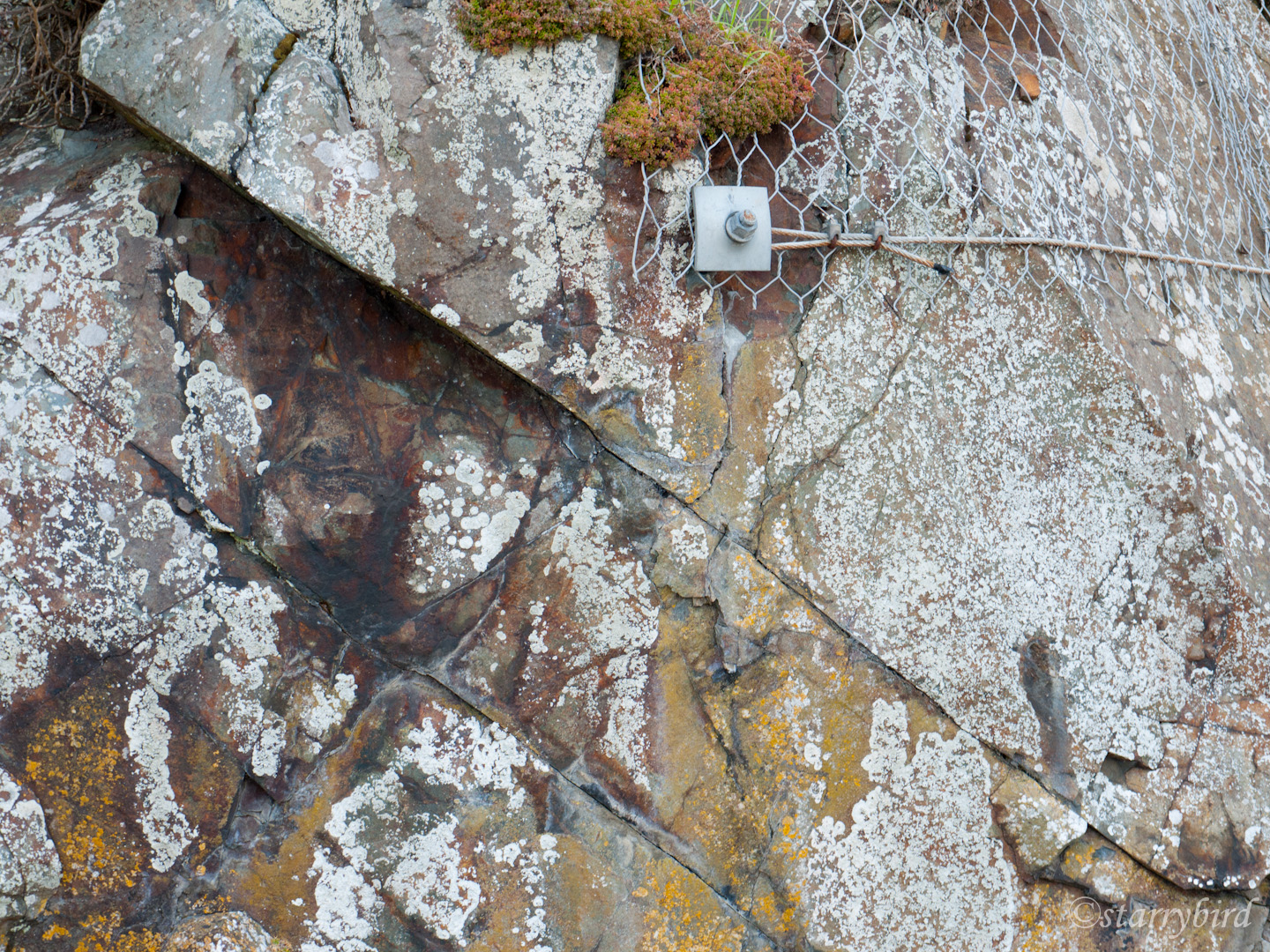
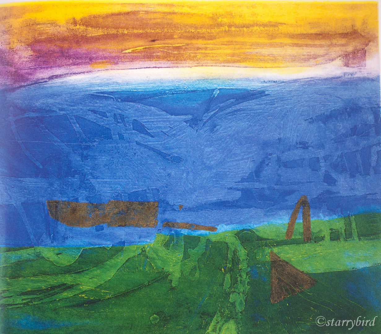
Print 3 – St Ives Cliff

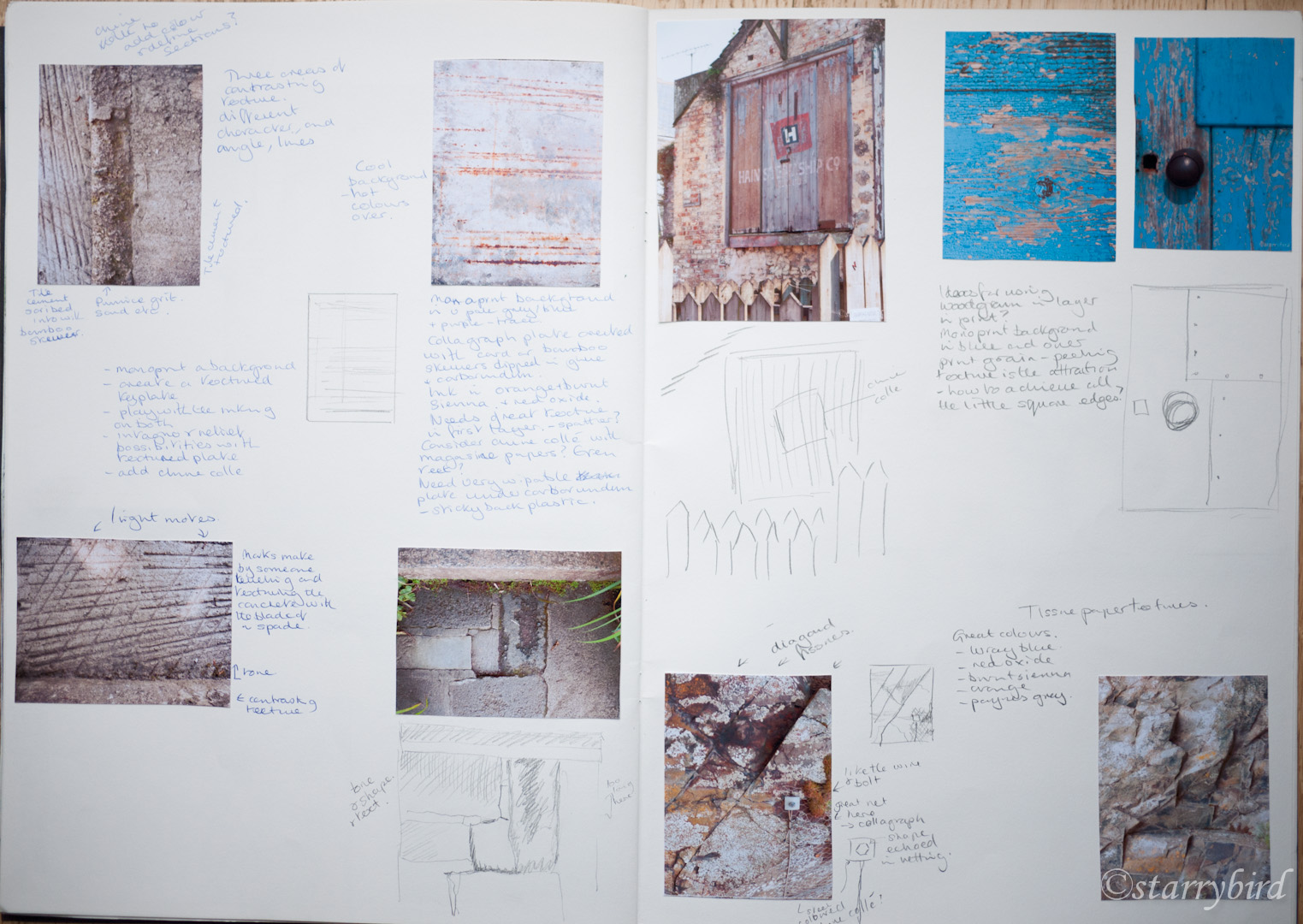
In the Hepworth garden and around St Ives, inspired by sculpture,  I collected images of textures and shapes and experimented with these in my sketchbook.

st ives textures (1 of 24) st ives textures (5 of 24) st ives textures (14 of 24) st ives textures (16 of 24) st ives textures (19 of 24)

part 5 (17 of 19) part 5 (18 of 19)

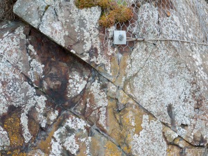
I could have created a whole series of prints out of this source material alone, and may yet do so. I chose a detail of the sea cliff to work from because of the mixture of man made and natural materials, the diagonal structures and the way the colours echoed the Hepworth bronzes.

I did not want to create an exact image of the cliff, but to pick up on the essence of the cracks, colours, the metal nut and mesh against the natural texture. I created a plate by cutting diagonal ‘cracks’ into card and then pealing back layers and overlaying glue and tissue paper. I then added mesh and string for the metal mesh and cable and cut out a shape for the nut. The whole plate was varnished to seal it.

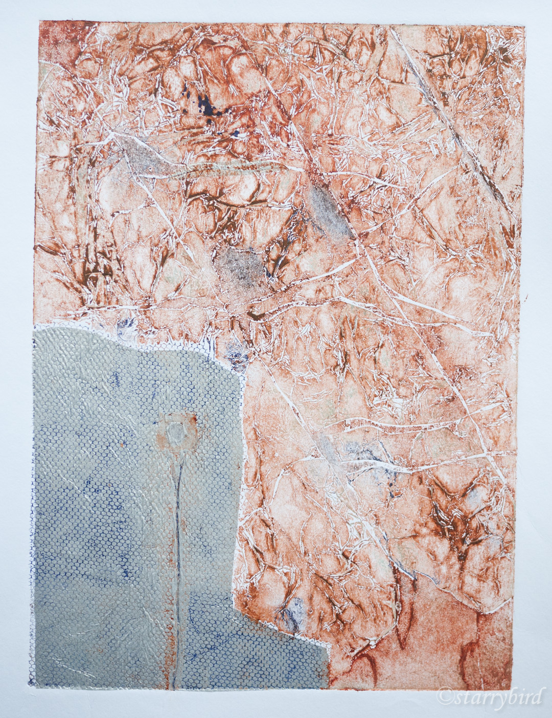
In my initial print, the contrast of material was emphasisied by the addition of silver tissue over the mesh. Small areas of silver tissue were applied in other areas to create a rhythm. Unfortunately the mesh didn’t really print over the silver, but it got completely lost in the texture of the rock, so I abandoned that idea.

part 5 (66 of 57)

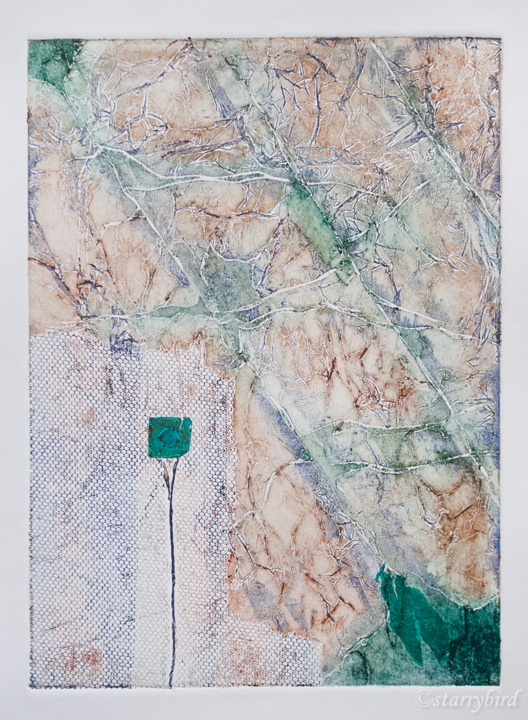
I decided to use coloured tissue to add colour and tone and to reuse the colours in my previous print to link to the previous print and bronze. The print was inked intaglio in red oxide and burnt sienna, wiped and then rubbed over with french blue and viridian.  Again tissue was applied in several areas for rhythm.

part 5 (67 of 57)

The additional colours added interest but lacked tonal range.

part 5 (65 of 57)

Next I added more ink and areas of tissue but the balance of tone between the mesh and rock doesn’t work and the areas of tissue aren’t integrated into the design. I reinked with more ink in the mesh area and placing tissue just into the deepest crack areas. This has produced a better range of tone across the print and a better rhythm of colour.

part 5 (75 of 57)

 Critique

I have used reference photos for inspiration and exploration into abstraction. I wanted to produce a print which would drawn the viewer into the texture and colour without any need for them to recognise the original subject.

The colours were again suggested by the patina and verdigris on bronze inspired by Hepworth’s work, and by the metal oxides in the rock face.

The success of the print depends on contrasts.  The oranges and blues are contrasting colours and create an interplay of cool and warm colours. There is also a contrast in texture between the naturalistic ‘cracks’ and the man-made regularity of the mesh. The torn areas of tissue contrast with the regular square and hexagon. There is a wide range of tonal contrast across the whole print. The diagonal cracks contrast with the rectilinear lines in the metal.

I am concerned that the print lacks a single centre of focus but the areas of dark tissue and cracks do lead the eye around the print, rather than it gravitating to one point.

A collagraph plate develops as it is repeatedly inked which makes the process unpredictable but can also lead to happy, unexpected results. Inking at different levels is difficult to control and I am aware that I need a lot more experience to reliably achieve a desired result, but I am pleased to have created the interplay of colour, tone and texture in this print.

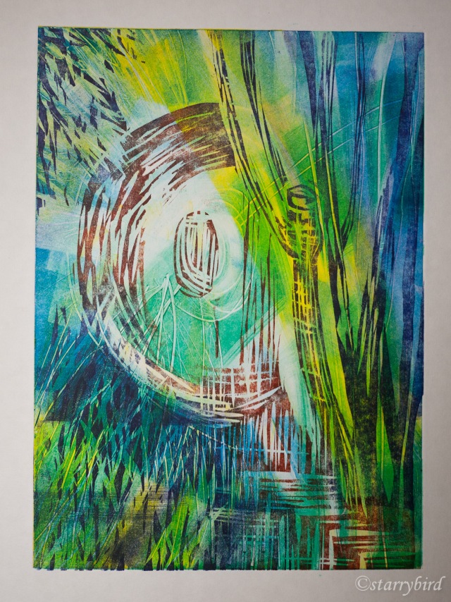
Print 4 – Hepworth’s Garden I

When researching combined print techniques, I worked at the work of Barbara Rae and how she uses creates layers monoprints, overprinted with etching or collagraph. It has exercised me how she overlays her vivid and contrasting colour combinations without producing muddy neutral colours. I had attempted my own version during the research and was keen to have another attempt at combining monoprinted layers with a carborundum ‘key’ print. Hepworth sculpture in the context of her green and leafy garden seemed the perfect subject.

garden woodcut skb (1 of 1)

I had a vague idea of what my initial background layers should look like having played with watercolour in my skecthbook, but I wanted to develop each one in response to the developing print. My final carborundum layer was loose sweeps of micaceous oxide brushed onto thin plastic, gently echoing the broad shapes of her sculptures, their plinths and the steps in the garden. These shapes were wiped to soften them and drawn back into.

In order to get thin luminous layers of ink, I wanted the most response from my paper, so I have used thin Japanese Hosho tissue which was left for 12 hours between damped tea towels.

I worked from light to dark with my background layers in complimentary colours and then printed the carborundum plate in a contrasting colour. I used the same colours as my previous two prints in the series, with the addition of yellow.

In my first attempt, I have drawn into the three background layers to suggest the foliage of the garden, and rollered areas and wiped to give tonal and colour range and to suggest areas of shade and sun. The carborundum print was intended to suggest bronzes seen through the foliage.

garden (2 of 2)

This didn’t quite create the feeling of vegetation, cool shade or mystery I was after. I replaced the yellow with a cool violet blue in the next attempt, and made more definite marks for the vegetation.

garden (1 of 2)

Critique

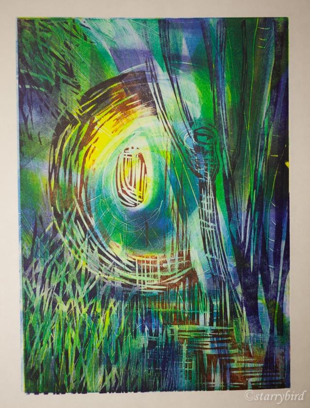
The idea for this print came to me almost in a dream, and it has a dream-like quality to it. I hope the viewer can feel the cool, calm peace of Barbara Hepworth’s garden with the massive bronzes glimpsed through the foliage.

The layers of complimentary colours, rolled on in different areas, wiped and drawn into to represent foliage, have produced areas suggesting of trees and plants, shade and sun. I was worried that overprinting these with a  contrasting colour would produce a muddy neutral but the soft red oxide has retained its warmth. The  very thin translucent layers were picked up by the damped Japanese paper as I had hoped, giving a luminous effect.

The carborundum plate was inked lightly and well wiped. I wanted no background tone on the plate to muddy the other colours, and the shapes were to be just suggested. I think it was a mistake to use two similar sized  and shaped marks to the left and right of the plate.  My original idea was that this would give rhythm and unity but they are too similar in shape although different in weight. I think, also, that the ‘gravity’ of the carborundum plate should be a little lower in the print.

The quality of a soft carborundum plate, over the monoprint with its mark making, is a pleasing contrast. Creating this spontaneously, responding to each layer as it was printed, was the ultimate in creative fun.

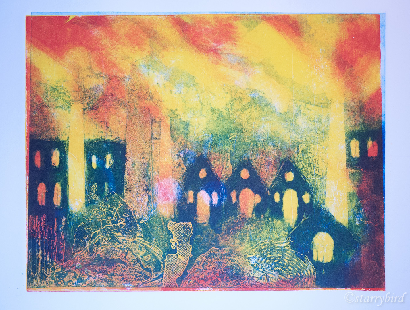
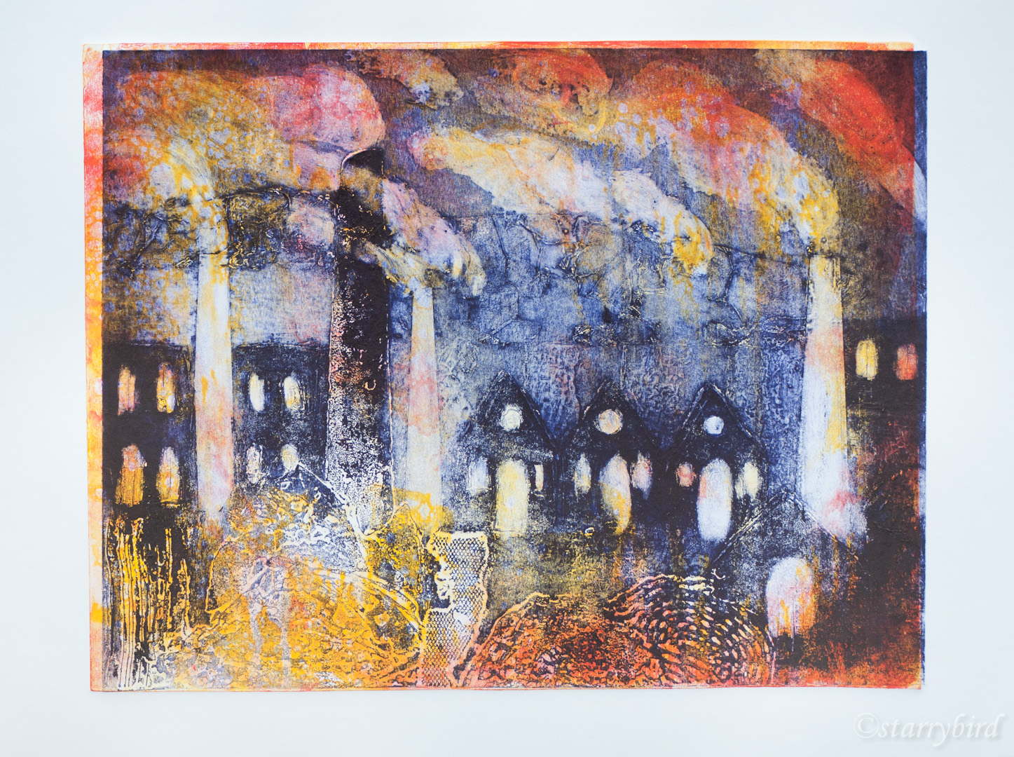
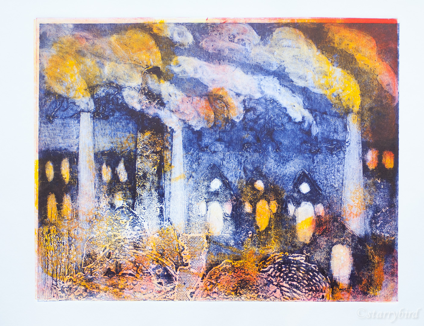
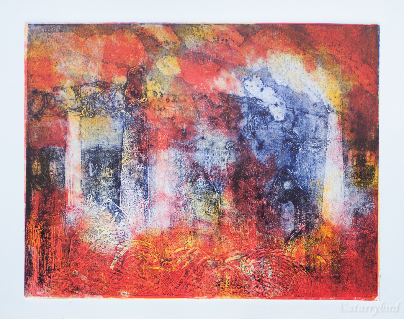
Print 5 – Hepworth’s Garden II

My final print continues looking at Hepworth’s garden, but in a different technique and with a greater emphasis on mark making. I wanted to give the print more structure. The background is four layers of monoprint colour but I have drawn into the ink more with cotton buds, crumpled paper and various sticks. My final layer is a woodcut. I was inspired to try this by the work of Gail Mallatrat. I have tried to create interesting marks which echo those on the monoprints but have a different, hard nature. I was very interested to see how this would affect the result compared to carborundum.

I have used the same colours as the previous print.

My first print was a complete hash up as I got the final plate the wrong way around and registration, therefore, wrong too, but it showed me where to go with my inking. My second print, informed by this, was so much better.

garden woodcut exp (2 of 2)

The monoprint layers were printed using light pressure in a press. The final layer was hand pulled. Five layers and two techniques made registration particularly challenging. My registration didn’t work quite so well with my third print, but I like the mark making and tonal balance of this best.

garden woodcut exp (1 of 2)

Critique

My final print continues looking at Hepworth’s garden, but in a different technique and with a greater emphasis on mark making. I wanted to give the print more structure. The background is four layers of monoprint colour but I have drawn into the ink more with cotton buds, crumpled paper and various sticks. My final layer is a woodcut. I was inspired to try this by the work of Gail Mallatrat. I have tried to create interesting marks which echo those on the monoprints but have a different, hard nature. I was very interested to see how this would affect the result compared to carborundum.

Five layers of ink in different colours have produced a richly coloured print. The addition of many more marks and the hard edged woodcut have created a different feel to the previous print. The atmosphere is less dreamy, more representational and dramatic. I think that perhaps the layers of mark making are a little too chaotic in places.

Making sure that I left plenty of white space in each layer has ensured that the colours all sing and that a good range of tones is produced.

The sculpture is much more clearly stated in this print. Smooth, subtle curves were hard to cut against the grain of the wood, and the shape is clumsier than the carborundum print. In the rest of the print, I would also have liked to make more jagged, organic marks than I managed.

I think these techniques work really well together and allow for a complex interplay of colour though positive and negative shapes. The many layers and variation in tone evoke the sense of a three dimensional environment; I want the viewer to imagine standing in the cool shade in Barbara Hepworth’s leafy, treed garden and seeing, though the vegetation, the warm sun striking a bronze in a clearing.

Posted in Part 5 Combining Print Techniques, Printmaking 1, Project 15 - Four Combination Prints | Tagged , , , , , , , , , , , , , | 5 Comments

Project 14 Investigating Combination Printmaking with Chine Colle

I have experimented with chine colle at earlier points throughout the course, combining various papers such as tissue, Lokti, Kahdi and gold leave with woodcut, collagraph and linocut.

family (6 of 7)

Collograph plate with chine colle and burnt texture

Collograph plate with chine colle and burnt texture

Two layers and chine colle on khadi paper.

Two layers and chine colle on khadi paper.

I wanted, in this project, to be rather more ambitious and use the technique to include a digital image. This was suggested to me by my photographic references and  sketchbook development looking at iron smelting and casting.

part 5 (12 of 19)part 5 (13 of 19)

I felt the colours and activity in some photos taken of a video would work particularly well with textural printing. In particular, I think they capture the shimmer of the extreme heat of the processes.

coalbrookdale (6 of 26)

I prepared my materials by mounting acid free tissue onto printer paper using repositional spray glue, and printing my photos. At present, I don’t have pigment ink in my printer, so this is not archival, but that would definitely be the way to go if successful as a technique.

I prepared a collagraph plate using my method of applying various media to a kraft board and melting it to give the impression of molten metal and slag. My first idea was to have very hot colours surrounding the digitial image but my proof was unsatisfactory. The tonal contrast between the photo and the ink is too great and the yellow has produced a poisonous green over the blue. I could have scaled the photo down so that it was not overprinted but I wanted to integrate the photo into the print. For this reason, I didn’t cut out the photo, just tore it into a rough shape.

part 5 (49 of 57)

 My next print was better. A change of palette has better echoed the colours and tones in the photo, allowing it to integrate better. I inked the plate intaglio  with a wider range of reds and oranges and then, after wiping, rolled over with a blue echoing the photo. I think this works much better.

part 5 (55 of 57)

 I tried using the other photo of figures with a steam hammer (such a great shape) but I don’t think it works as well; the larger figure provides more of a narrative and connection. I also used a monoprinted background in this print to try and increase the range of colours and texture but that wasn’t particularly successful.

part 5 (50 of 57)

I produced a series of these prints, experimenting with the levels of inking, the relative viscocities and the tonal balance around the photo. There is a difficult balance to be struck between the integration of the photo, tonal balance across the print and retaining interesting texture.

part 5 (52 of 57)

 I also tried adding gold leaf to heighten the effect of molten metal. I found this extremely difficult to apply and when I managed it, the gold leaf stuck to the plate, not the print. I therefore turned to gold tissue paper, which was much easier to apply. The gold only really shows through in the sparsely inked areas, and isn’t as dramatic an addition as I had hoped. Also, I am sure that it would not be archival.

part 5 (51 of 57)

The Alchemist

Critique

In this print, my ambition was to use chine colle to create a narrative about the heat and fury of smelting iron and to create an image which combined two views; the process and the product. I also wanted to push the ideas of chine colle further than I had previously by using a digital image printed onto tissue paper and integrated into the plate design so that one might be looking down into a pool of molten iron and seeing its creator reflected in the surface.

Combining the digital image successfully with the print proved very difficult. The edge of the photo is hard to loose in the printing unless the tones are very carefully managed, and I have only been partly successful. However, if the tones are too uniform, the print looses impact. I think I have probably achieved the best balance to be hoped for with this photo.
Manipulating the tissue, both for digital printing and placing on the plate, is very fiddly. I found printing onto Japanese Hosho tissue much easier, but the slight extra thickness means the print has not dried quite so uniformly flat. However, preparing my own tissue does give me more control over the archival nature of the materials.

The idea of incorporating digital images is exciting, but very challenging to bring off successfully. This plate was designed around the image, and needs the image to provide a centre of interest.

The richness of the colours and texture do invoke the feeling of molten metal and heat I was looking for, and give the print real impact. The additional of gold tissue is interesting but not as strong as I hoped.

Combining digital print with traditional printmaking techniques isn’t something I have seen used much. The two types of image create contrast and interest in a print and the development of a richer narrative or atmosphere. I think this technique offers lots of opportunity for future development and originality.


Print 3 – Nude

After a life drawing class, I often wonder if I could create a print from my work and how I could most effectively capture the freedom of a drawing. I have, in the past, tried creating drypoints, but they look very thin without a lot of cross hatching which I don’t feel sits well with the softness of curves. In my research into chine colle, I saw several prints featuring chine colle used effectively to add tone and a sense of volume to a drypoint. Tone could also be added using carborundum sparingly.

A recent drawing in charcoal was selected on the basis that it combined bold line with tone. I photographed it (it’s A3) and reprinted it at A4. This was placed under a piece of drypoint acetate and redrawn using a Dremel. I chose this, rather than a drypoint stylus, to try and maintain the spontaneous feel of the lines. These were redrawn warts and all; I didn’t make any adjustments or ‘corrections’ as I wanted to retain the feel of the original drawing. For the same reason, I applied micaceous oxide paint with a finger, rather than a precise brush.

031214 (5 of 7)

I had in mind some tissue which had been passed through the press in order to clean earlier Alchemy plate, but I also created some extra tissue. I prepared it with pigment inks (Inktense) by dipping, dripping and painting. This weakened the paper and most of it simply melted when I came to apply glue.

I did not proof my plate before printing on tissue as I knew that the burr and the micaceous oxide would wear away very quickly. The colour of the ink used was dictated by the colour of the chine colle.

In this first print, the tissue tore and melted as I tried to lift it off the glue, but that has produced some interesting shapes.

part 5 (8 of 19)

This is also painted tissue which just made it onto the plate. The plate is over-wiped leaving the image too pale. The tissue needs to be quite pale and subtly marked or it overpowers the print.

part 5 (6 of 19)

The next two prints use collagraph printed tissue. The tissue has created too hard an edge above the breasts on the left. The right hand print has a accidental diagonal element which helps the image, but isn’t as well wiped. I like the texture in the right hand print but it doesn’t really relate to the subject and the way is falls across part of the body.

part 5 (9 of 19) part 5 (7 of 19) part 5 (5 of 19)
Final, selected print.

Critique

After a life drawing class, I often wonder if I could create a print from my work and how I could most effectively capture the freedom of a drawing. I have, in the past, tried creating drypoints, but they look very thin without a lot of cross hatching which I don’t feel sits well with the softness of curves. In my research into chine colle, I saw several prints featuring chine colle used effectively to add tone and a sense of volume to a drypoint. I was excited by the subtle colours and textures I had created printing my earlier Alchemy print onto tissue, and felt that these could be used to good effect in this context.

I have used a combination of drypoint, carborundum and chine colle to give the figure impact and volume. However, in copying a drawing, its nature is changed and the feel of the original compromised. The sweeping lines of a Dremel and the soft carborundum are as close as I have ever got to capturing a life drawing.

The figure needs some added interest to offset all the white space and the chine colle provides that. The shape of the tissue was chosen to break up that area of white space to the left and to give a diagonal thrust balancing the backward lean of the body. The shape of the tissue is a bit too convex and uniform. I would wish that the top edge were less straight.

This ink on the tissue is very slight and pale but still looks quite strong in the print. The contrast between the tone of the body and the tissue is a subtle balance and I think this print achieves it best.

I do like the softness of the carborundum for the subject but it is a blunt instrument to apply subtly; the shadows are too dense and abrupt. However, it is the carborundum which gives the print its impact. I hope it conveys to the viewer the beauty and endless interest of the human body.

Posted in Part 5 Combining Print Techniques, Printmaking 1, Project 14 - Combination Printmaking with Chine Colle | Tagged , , , , , , | Leave a comment

Research Point – Chine Colle

Chine colle is the application of pasted thin papers or metal leaf to a plate such that when it is printed, the inked image will overprint the applied paper and integrate it into the image and the support. Printmakers use the technique to produce a variety of effects:

Sally McLaren uses it to add soft shapes and additional colours to her etchings, eg Land Series

Barbara Rae uses printed images to add a figurative or narrative element to her prints (in this example a monoprint) Codfish Inishkeas

 Brenda Hartill uses metal leaf to add a reflective, shimmering element to her collagraphs, eg Silver Window I

Terry Winters used chine colle to juxtaposition two contrasting but related images (eg Untitled, Tate), both, in fact, prints but the one chine colle-ed into the other. The contrast lies in the drawn nature of the etching against the photographic nature of the photogravure print.

Kitaj used chine colle as an extension of collage to both juxtaposition and overlay related images. In The Red Dancer of Moscow , British Museum, he has used it to provide the figure with a ‘skirt’ but also to include related images to create a narrative. Often he would included printed materials and travel documents, tickets etc to create a sense of time and place or context.

Thoughts on using applied tissue:

  • paper can be torn or cut depending on the crispness or softness of shape required
  • tissue can be used to extend the edge of a print outside the plate edge
  • archival issues, acid content, lightfastness
  • papers can be painted, printed (commercially or fine art), coloured, textured (Japanese, Kadhi, Lokti etc)
  • thickness can be an issue, glue can penetrate very thin tissue and stick it to the plate rather than the print, thicker papers can leave a halo and warp the support

Glue:

  • acid free pva or cornflour
  • needs to be easily spreadable but not too high water content
  • applied thinly so that none is pressed out at the edges when printing

Posted in Printmaking 1, Research Point - Chine Colle, Research Points | Tagged , , , , , , , , , | Leave a comment

Project 13 Combination Monoprint

For this project, I wanted to continue to build on work from previous projects where I felt my plates could be enhanced by a monoprinted background. In particular, I wanted to look at the idea of combining a monoprinted background with a collagraph plate printed as a ‘key’ plate.

in PA previous assignment I had cut a lino plate of a snail but felt I hadn’t realised the background effectively. My tutor suggested a graphic background would have been more successful and to consider the work of Mustafa Hulusi. His ‘expander’ graphic would have been perfect but I had to think of my own approach.

part 5 (16 of 19)

I played about with some monoprinted backgrounds developed from the idea of the shell spirals, with a obligatory nod to Matisse. I felt the contrast with a really graphic background would be more powerful.

snail (8 of 8) snail (7 of 8) snail (6 of 8) snail (5 of 8)

I then looked at graphic backgrounds such as warning or poison notices, and settled on one developed from electricity warnings. To achieve the graphic element this was linocut rather than monoprinted.

snail (4 of 8) snail (3 of 8)

I then tried to monoprint an iridescent slimy snail trail as an extra layer, but, for the irridence, I had to use acrylic paint, and this warped the paper.

snail (1 of 8)

Critique

This print is a rework of a print from an earlier project, suggested by my tutor. I think this linocut is greatly enhanced by the addition of a graphic background, inspired by Hulusi’s expander graphic. My plan was to include a monoprinted iridescent slime trail, but the iridescent paint adversely affected the paper, rippling it badly.

The contrast between the soft curves of the snail with its rather organic cutting created by using a Dremel, and the hard, straight edges of the background ‘warning’ work very well. I think the scale of the background graphic is just a bit too big.

I would have preferred to use neon inks, had I had any available, although I understand that neon ink is always of questionable archive quality. I was tempted to introduce more colours in the background but felt that this would detract from the strength of the graphic image.

In my final prints, I masked the non-printing areas with tissue paper to create as clean a print as possible with no cutting ‘noise’. I think the print is improved by masking out the cutting lines.

Ultimately, I find this print unsatisfying because I don’t think I have moved the idea on enough from Hulusi’s expander logo to make it my own. However, it has shown me how two styles can be combined and contrasted to great effect. I have tried to use this insight in my combination prints.


Further combination Monoprints.

These prints didn’t really fulfil the core idea of a monoprint background with a key plate overprint, but I hoped my next print would.

In a previous project, I had been looking at industrial buildings, and this was reinforced when  I recently visited Ironbridge, where I saw the 18th century blast furnaces and iron being cast.

I wanted to capture the heat and fury of the process, and the way the night sky was lit up in the past by the blast furnaces. I wanted to use ideas of melting, flowing and bubbling. The technique of using a blow torch on a collagraph plate seemed perfect for this.

coalbrookdale (17 of 26) coalbrookdale (14 of 26) coalbrookdale (12 of 26) coalbrookdale (7 of 26) coalbrookdale (6 of 26) coalbrookdale (4 of 26)coalbrookdale (16 of 26)

I had taken a lot of reference photos on site, including some of a video showing a blast furnace and steam hammer in action. I used painting, drawing photos and collage in my sketch book to distill my ideas.

part 5 (10 of 19) part 5 (11 of 19)

part 5 (12 of 19)part 5 (13 of 19)

My first prints used monoprinted backgrounds in yellow and red layers. The ink was rolled on to a Kraft board plate, wiped in places, and spattered with white spirit which was allowed to run and drip. My object was to produce a background that looked hot and molten.

coolbrookdale (2 of 6) coolbrookdale (3 of 6)

On the back of the Kraft board plate (so identical size),  I applied fabric, tile cement and pva glue and subjected these to a blow torch to make them melt and bubble. I also applied carborundum and brown parcel tape to create the silhouettes of industrial buildings and chimneys. I proofed this and  made some minor changes.

coolbrookdale (5 of 6)

Collagraph plate proof

I overprinted in cyan initially.

coolbrookdale (6 of 6)

My registration was poor, I think because my key plate was warped by the heat and didn’t meet the rollers flat. Also, I had thought my plate exactly square but I think it was a little out, magnifying inaccuracies when I printed it in reverse over the monoprint.

I thought the blue too bright and producing too much green, so reprinted in blue/black.

blast furnace (4 of 7)

Again, poor registration and the black ink is weak; overwiped. I had three more backgrounds and moved to french blue for the key plate.

blast furnace (5 of 7) blast furnace (7 of 7)

These two prints also have registration issues and the smoke from the chimneys has been overwiped and looks contrived. In my final print I decreased the quantity of blue ink to create a less contrasty and representational image.

blast furnace (6 of 7)

Critique.

This print was inspired by explorations into industrial architecture and by the history of iron founding at Ironbridge. The foundries worked continuously and lit the night sky. I wanted to capture the heat and fury of this industrial landscape whilst not being too representational. The colours and the large size of the print (nearly A2) are intended to make instant impact.

The print is a combination of a monoprinted background, in a yellow and then red layer, textured with white spirit and also draw into. This was then overprinted with a collagraph ‘key’ plate made by melting materials on a board with a blowtorch, and adding carborundum and tapes for tonal range. The objective of this plate was to imply the landscape through materials in flux from one state to another, mirroring the smelting process.

The size of the print is right at the limit of my press bed, and this added to registration problems caused by the board warping under applied heat.

Reference photographs taken at Ironbridge inspired my choice of colours. The use of blue, rather than the traditional black for a key plate, contrasts with and emphasises the hot colours. I have achieved a wide tonal range in the print but would have liked to have stronger blue ink at the bottom of the print to really bring out the textures there. The texture at the bottom of the plate is, I think, its most successful element and I would have liked it to be more obvious. However, the greater wiping of the blue plate has made the buildings less obvious, subtler and more abstract.

On the whole, I feel I have achieved the rich colour and texture I hoped for by combining these techniques. The industrial process of making metal offers a rich seam of subject matter to further explore.


Posted in Part 5 Combining Print Techniques, Printmaking 1, Project 13 - Combination Monoprint | Tagged , , , , , , , , , | Leave a comment

Research – Combining Monoprints with Other Techniques – Barbara Rae

When trying to look at examples of prints combining monoprinting with other techniques, Barbara Rae instantly came to mind. I saw two of her works in the ‘flesh’ at this years RA Summer Exhibition, and they stood out for the strength of the image. This impact comes partly from her use of rich, strong, layered colour, but also from the blocks of contrasting tonal value across the prints. At first glance, her prints seem deceptively simple; overlapping blocks of colour which have been drawn into to just suggest her subject.

rae (4 of 6)

Rae, B. 2006. Island Sentinel. [Monoprint 38cm x 38cm] Lambirth and Wardell (2010) p137


The simplicity is of course a deception. The idea or design may be uncluttered and direct, but the final print is the result of subtle, considered technical processes. She talks about the need to place colours sparingly and in consideration of the previous colour layers (Lambirth and Wardell (2010)). Relative transparency and opacity, positive and negative shapes, line and texture are all carefully judged. The prints have a spontaneous feel because she develops them responding to the effect of each layer. She describes the process as ‘planned discovery'(Lambirth and Wardell (2010, Preface).

Although the fundamental design is no doubt clear in her head at the outset, she revels in experimentation and responds to the print as it develops through its many layers. It would be so interesting to see her sketchbooks in relation to her finished work and understand how this process of conception, developed through the physical process, is realised in the final print.

Rae works with monoprints, collagraphs, etchings and screenprints, often combining several or these, but in each she is working towards a painterly interpretation. Collagraphs and etchings are often used as a final tonal layer to “hold it together”(Lambirth and Wardell (2010, p11) . This ‘key plate’ would traditionally be black, but often Rae uses a vibrant blue, or even an opaque white or pale blue.

rae (2 of 6)

Rae, B. ‘Seafield’ 1995, [Etching and Collagraph, 40cm x 45cm] Lambirth and Wardell (2010) p81

It is clear that she revels in colour. Many of the vibrant colours in her prints are created by the overlaying of transparent layers. She says of her early experiments “it would have been so much better if someone had told me not to put the same colours everywhere” (Lambirth and Wardell (2010, p11) and, indeed, the lightest tones are often where no ink  as been allowed, giving strong tonal range, for instance in the two prints above.

Excited by these ideas, I attempted a monoprint in this style. I inked up a perspex plate in successive layers, considering and developing my print as I went. I used damped paper and a registration sheet, leaving these pinched in the press between layers. This dictated working briskly before the paper dried out and shrank.

exploring rae (1 of 2)


I really enjoyed the developmental process and the experimentation. There are four layers and colours; any more would have been chaotic, I think. I tried to combine positive and negative shapes, and I think that this has worked. The design has been over constrained by the limited number and size of rollers I have. I think this would have been enhanced by the final blue layer being created as a carborundum plate. I can see that it would take me years of experimentation, building up experience, to finely judge the layering of colours, transparency, opacity and tone.

References

Lambirth, A and Wardell, G. (2010) Barbara Rae Prints. London: Royal Academy of Arts

Posted in Combining Monoprints with Other Techniques - Barbara Rae, Part 5 Combining Print Techniques, Printmaking 1, Research Points | Tagged , , , , , , , , , | 2 Comments

IPE 2014

To challenge myself to produce an edition, I entered the International Print Exchange run by Green Door Printmaking, Derby. I entered a small drypoint developed from looking at Morandi’s work and described here. You submit an edition of 10 prints, one gets exhibited and in return you receive eight prints. The exchange is unjuried.

ipe14 (2 of 11)ipe14 (1 of 11)ipe14 (3 of 11)

This week I received my pack of prints and what a little packet of joy it was! The parcel was beautifully presented and I was surprised by the personalisation and the information included. I particularly liked being told who my prints were from (impossible to read the signatures) and who had been sent mine.

ipe14 (6 of 11)

ipe14 (11 of 11)

My prints came from the UK, the Netherlands, Poland and Australia and my prints went to the UK, Australia and Taiwan. I love the sense of connectedness this gives me with printmakers around the world. The enclosed letter also gave a list of all the participants, a breakdown of where they came from, their chosen printmaking method and the paper used. Printmaking manna from heaven!

ipe14 (7 of 11)ipe14 (8 of 11)ipe14 (10 of 11) ipe14 (9 of 11)

I have really enjoyed the challenge of working to brief (here just physical dimensions) and editioning. Sharing my prints with others around the world and seeing their work in return has been a very rewarding experience. I hope to enter again. My sincere thanks and congratulations  to the organisers.

The IPE is dedicated to the memory of a Green Door printmaker:

ipe14 (5 of 11)


Posted in Experimental Printmaking, Printmaking 1 | Tagged , , , , , , , , , | 3 Comments